A Quiet Roaster on Woodman Drive
Pettibone Coffee has been operating out of 215 Woodman Drive in Dayton, Ohio since 2017. The shop is the kind of specialty roaster that does not need to announce itself loudly. The interior is restrained. The wordmark is sober. The coffees are sourced carefully, the cup notes are honest, and the people behind the counter talk about origin work the way someone talks about a friend's farm. Walk into the roastery and the brand reads as confident without ever raising its voice. Dayton is not a city most coffee maps highlight, and Pettibone has built a small, loyal following by doing the work and letting the product speak for itself.
That same approach has shaped how the company thinks about packaging. Pettibone has been a Savor Brands customer across both generations of their bag. We printed their first bag in 2020 and their second bag in 2025, which means we have had a front-row seat to the way the brand has clarified itself across two production runs and five years of growth on Woodman Drive. The first bag was a beautiful object by every measure. The 2025 redesign is something different. It is not a refresh. It is a confident second statement from a roaster that has clarified what it wants to say on the shelf. The two bags side by side tell the story of a specialty coffee brand maturing in real time, and they do it in a way that almost any growing roastery can learn from.
The 2020 Bag: A Beautiful Object That Tried to Do Everything
The first Pettibone bag, produced through Savor Brands in 2020, came out of the gate doing what specialty coffee packaging was expected to do five years ago. The front panel held a small, tidy apple blossom logo inside a circular medallion. The medallion sat over a deep navy field. A warm yellow bottom panel ran across the lower third of the bag and gave the whole composition a sense of color blocking. The side panels were filled with delicate gold linework apple blossoms in a looser, more decorative style than the front medallion. The origin label was a glossy gold rectangle with cup notes and farm details printed in elegant serif type. Every panel was working.
The bag was undeniably gorgeous. It also showed how specialty coffee design tended to think back then. The job of the bag was to feel premium, and that often meant filling every surface with some kind of decoration. The gold linework on the sides was the part of the bag that did most of the visual storytelling. The front logo was relatively simple by comparison. The eye started at the medallion, moved across the wordmark, drifted down to the warm yellow band, and then turned the bag in the customer's hand to find the gold floral details on the gussets. It was a generous design. It was also a busy one.
- Navy and bright gold color story across every panel
- A small apple blossom logo medallion as the front anchor
- Loose gold floral linework on the side gussets
- A warm yellow lower band that grounded the composition
- A glossy gold origin sticker in classic specialty coffee format
The 2025 Bag: The Tattoo Artist, the Back Panel, and the Power of Restraint
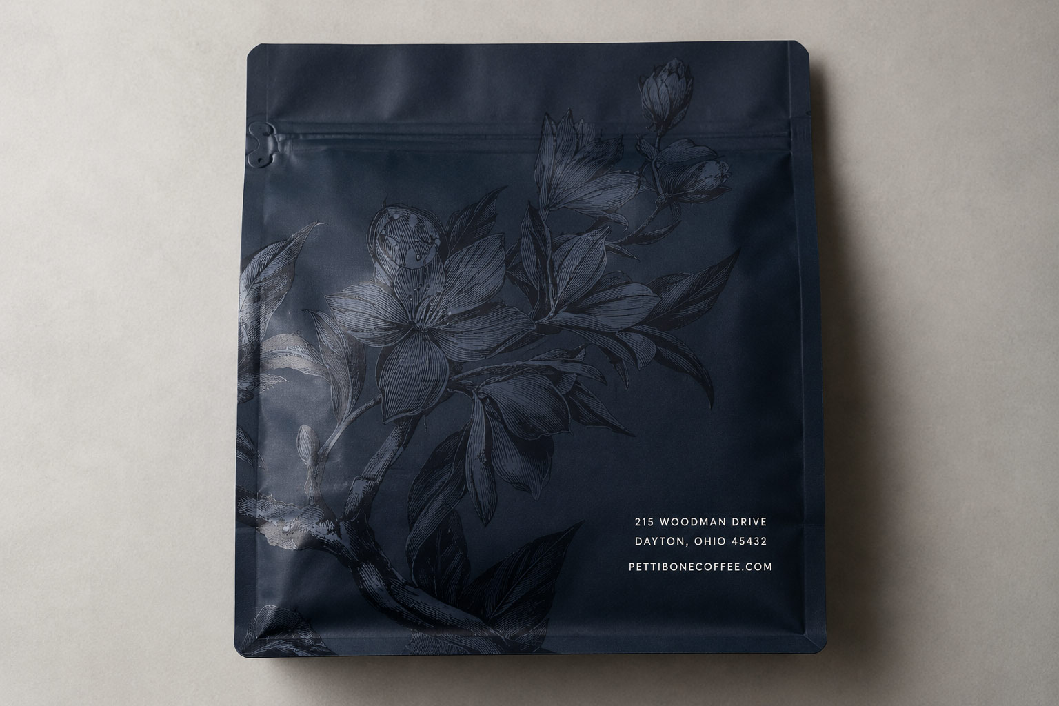
The second-generation Pettibone bag inverts almost every design relationship the first bag established. The gold is gone. The bright yellow bottom panel is gone. The decorative gold linework on the sides is gone. The front of the new bag carries the wordmark in large, clean white block type and almost nothing else. It is monochromatic. It is restrained. It is the kind of packaging that, at first glance, looks like the brand has subtracted rather than added. That first impression is exactly the point.
The reason the new bag can be this quiet on the front is because the back panel does something the old bag never tried. Pettibone commissioned a tattoo artist to draw the apple blossom illustration that now lives across the back and side gussets. The result is a richly detailed tonal botanical drawing in the style of a vintage engraving, rendered in darker blues over the deep navy field of the bag. The linework is dense, the petals have weight, the branches curl with real character, and the whole composition reads less like a logo and more like an artifact. It is the kind of illustration a customer wants to look at, turn the bag for, and photograph.
What makes the design choice clever is the way the simplicity of the front panel actually amplifies the back panel. A bag with detailed work on every side teaches the customer's eye to stop reading any single area carefully. A bag with a quiet front and a loud back trains the eye to follow the bag around. The first time a customer turns a new Pettibone bag and sees the tattoo botanical, the reveal feels earned. That is something the 2020 bag could not do because every panel was already saying something.
- White block wordmark sits alone on the front panel
- The apple blossom moves from a simple medallion to a richly detailed tattoo-style botanical on the back
- Side gussets carry the same botanical line for continuity around the bag
- The restraint on the front earns the visual payoff on the back
Bright Stickers Replace What Gold Used to Do
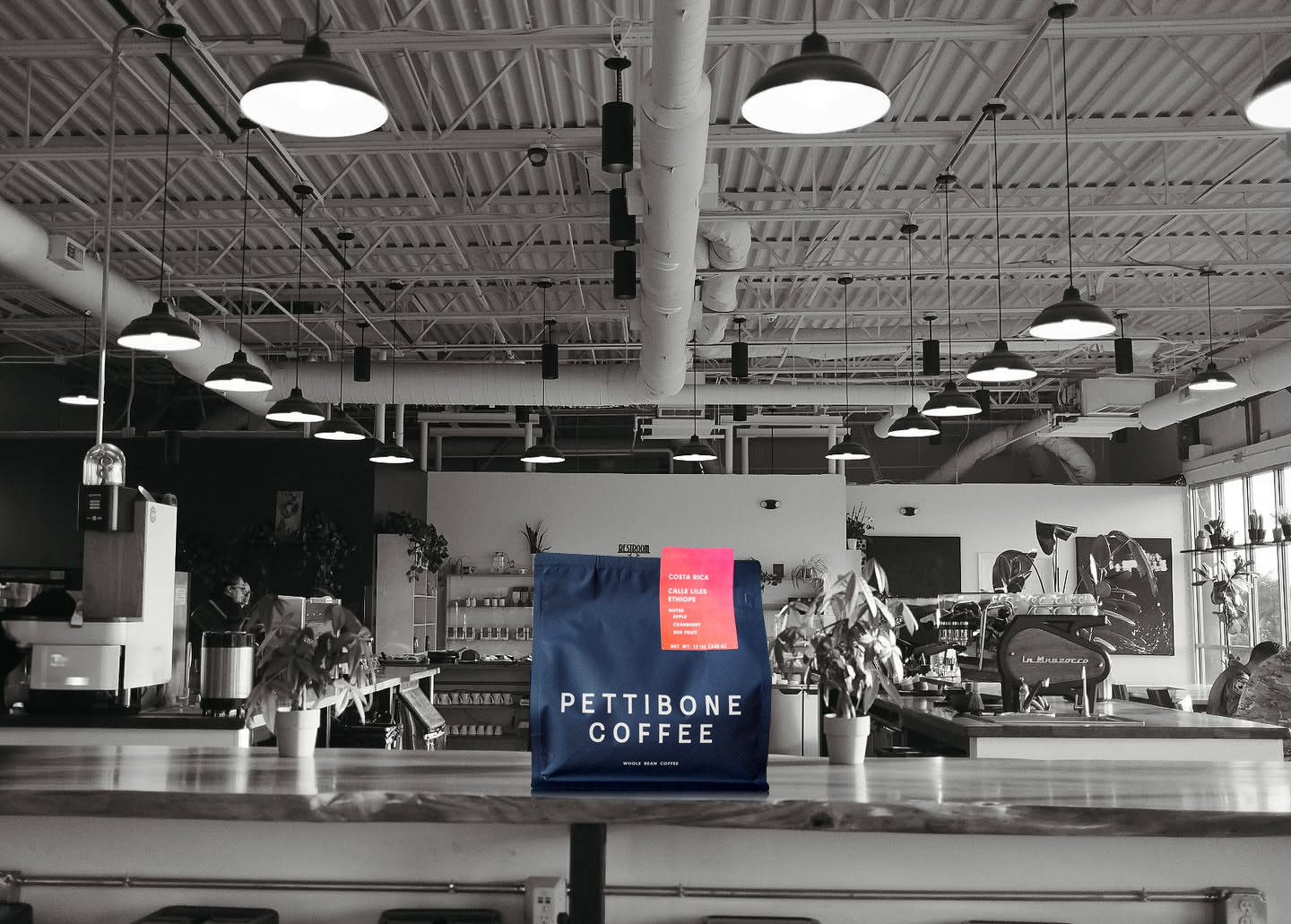
The old bag handled origin information with a gold foil-style label. It was beautiful, but it locked Pettibone into a single visual register for every coffee they released. A washed Rwanda and a macerated natural from Colombia both arrived in the same gold-on-navy template. The new bag solves that problem in a much smarter way. The bag itself stays monochromatic and consistent across every release. The origin and process information now lives on bright, rectangular stickers applied to the upper right of the front panel. Each coffee gets its own color.
The orange-to-pink gradient sticker on a Colombia El Vergel reads like a sunset. A hot pink sticker on a red honey processed lot reads like the fruit itself. A lime green sticker on a co-ferment honey signals freshness and experimentation. The bag is the same. The sticker is the story. This separation is the most operationally smart part of the redesign. Pettibone can introduce a new single-origin or process tomorrow, design a sticker for it in an afternoon, and have it on shelf within a week. They do not have to print a new bag for every release.
This is the kind of decision that quietly makes a roastery more efficient. The custom bag print run can be larger because the artwork does not change. The per-bag cost goes down. The shelf presence stays consistent across the entire line, which actually helps the brand read more strongly at retail. And the stickers themselves can do design work that a full bag print could never justify because the run sizes are smaller, the turnarounds are faster, and the cost per change is almost nothing.
- One consistent bag print run for every coffee in the lineup
- Bright stickers carry the color, the origin name, the process, and the cup notes
- Faster turnaround when a new lot lands at the roastery
- Stronger shelf cohesion across the full product line
The Specs Behind the Design
The 2025 bag is the second one Savor Brands has printed for Pettibone, and it is built on a quad seal box bottom structure, which is the most retail-ready bag format in specialty coffee right now. The bag stands square on a shelf, presents four clean print panels, holds twelve ounces of whole bean comfortably, and accepts a pull tab zipper that opens cleanly along a tear notch the first time and reseals on every use after that. The film structure is a 12 micron PET face over a 7 micron aluminum foil barrier laminated to a 110 micron LLDPE sealant. That is the same kind of high-barrier laminate that any serious specialty roaster wants for keeping coffee fresh through transit and shelf life. Pettibone also spec'd a whole bean valve and rounded corners on the bag, which are small details most customers never notice but every barista feels in the hand.
The single feature that defines the look of the new bag is the haptic varnish. Haptic varnish is a clear textured coating applied during printing that gives the bag a tactile, almost soft-touch feel without changing its color. On the new Pettibone bag, the varnish is applied across the dark navy field and over the botanical illustration. Pick the bag up off the shelf and your fingers tell you something is different before your eyes do. The bag does not feel like packaging. It feels like an object. That tactile signal is part of why the new design can be visually quieter on the front. The bag is doing storytelling work through your hands.
Pettibone produced the new bag with Savor Brands using our
rotogravure printing line, which is the only print process that consistently delivers the kind of solid color saturation, fine linework detail, and varnish layering that the new design requires. Rotogravure runs cost more to set up than digital, but the per-bag cost drops as the order quantity grows, and the print quality is the only way to get tattoo-style botanical detail to read correctly across a quarter million bags. The economics line up with the brand's approach. Print the bag once, print it well, and let the stickers handle the variety.
Bag Comparison: What Pettibone's Five-Year Arc Teaches Other Roasters
Looking at the two Pettibone bags side by side is a small lesson in how specialty coffee packaging design has matured. The 2020 bag was an answer to the question, how do we look beautiful and premium right out of the gate. It said the right things using the design vocabulary of its era. The 2025 bag answers a different question entirely. It asks, what do we actually need the bag to do, and how do we let the brand carry itself without trying so hard. Restraint is harder than decoration. The new bag is the more disciplined design by a wide margin.
For roasters thinking about their next bag, the Pettibone arc points at a few specific moves worth studying. First, give the back panel a real reason to exist. Most coffee bags treat the back as a place for legal copy and an address. The new Pettibone bag treats it as the room where the brand's most considered work lives. Second, let the bag be a stable canvas and put the variety information on a sticker or label that can change as fast as the lineup does. Third, invest in a tactile finish like a haptic varnish or a soft touch matte if the brand can support it. The bag that feels different in the customer's hand is the bag they remember.
- Use the back panel as a destination, not an afterthought
- Keep the bag print stable and let stickers handle variety
- Spend on a tactile finish if the brand can support the investment
- Subtract before you add
What This Looks Like for the Roastery on Woodman Drive
For Pettibone, the new bag also shifts something about how the brand presents itself in the cafe. Walk through the front door at 215 Woodman Drive and the large wordmark mural on the back wall now matches the wordmark on the front of the bag almost exactly. The pour over bar reads as part of the same visual system. The yellow apple blossom line art on the mural connects back to the bag's printed botanical without copying it. This is the kind of brand cohesion that small roasters can build into the second-generation packaging because the first generation taught them which parts of the identity were durable and which were not. The 2020 bag was a starting point. The 2025 bag is a brand that knows itself.
Pettibone is sourcing carefully from origins like Tolima, Colombia and Nyamyumba, Rwanda, working with single producers like Miguel Jiménez and cooperatives like COOPAC, and putting that work into the cup with a clear, restrained voice. The bag now matches the cup. A bag that matches the cup is the bag that builds a wholesale program, earns shelf space at the better grocery stores, gets photographed for editorial coverage, and makes the brand legible to customers who only see the product for half a second on a shelf. The bag is doing real commercial work for the roastery, and the design choices behind the work are choices any growing roaster can adapt to their own brand.
Closing: A Second Bag Worth Studying
The Quiet Confidence of a Roaster That Knows What Its Bag Should Say
Pettibone Coffee did not redesign its bag because the old one was failing. The 2020 bag was beautiful, sold coffee, and represented the brand well for the years it was on shelf. The 2025 bag exists because Pettibone has grown into a clearer version of itself, and the new bag reflects that growth honestly. A tattoo artist on the back panel, a haptic varnish underfoot, bright stickers carrying the variety, and a wordmark confident enough to stand on its own. Five years of running a roastery in Dayton, Ohio shows up in every one of those choices. The lesson for other roasters watching from the sidelines is that the best second bag is the one that knows what to leave out. Pettibone left out almost everything that was not essential. What is left is a bag that is going to look right for a long time. We are proud to have printed both generations of the Pettibone bag, and we are even prouder of how clearly the second one shows who Pettibone has become. For roasters considering their own next
custom coffee bags project, the Pettibone redesign is the kind of case study worth pinning to the studio wall.