We spoke with our partner Taylor Fields from Nostalgia Coffee Roasters on why they chose Roto over Digital:
How did you decide Roto was the right print process for you?
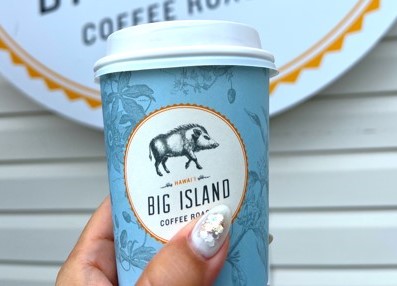
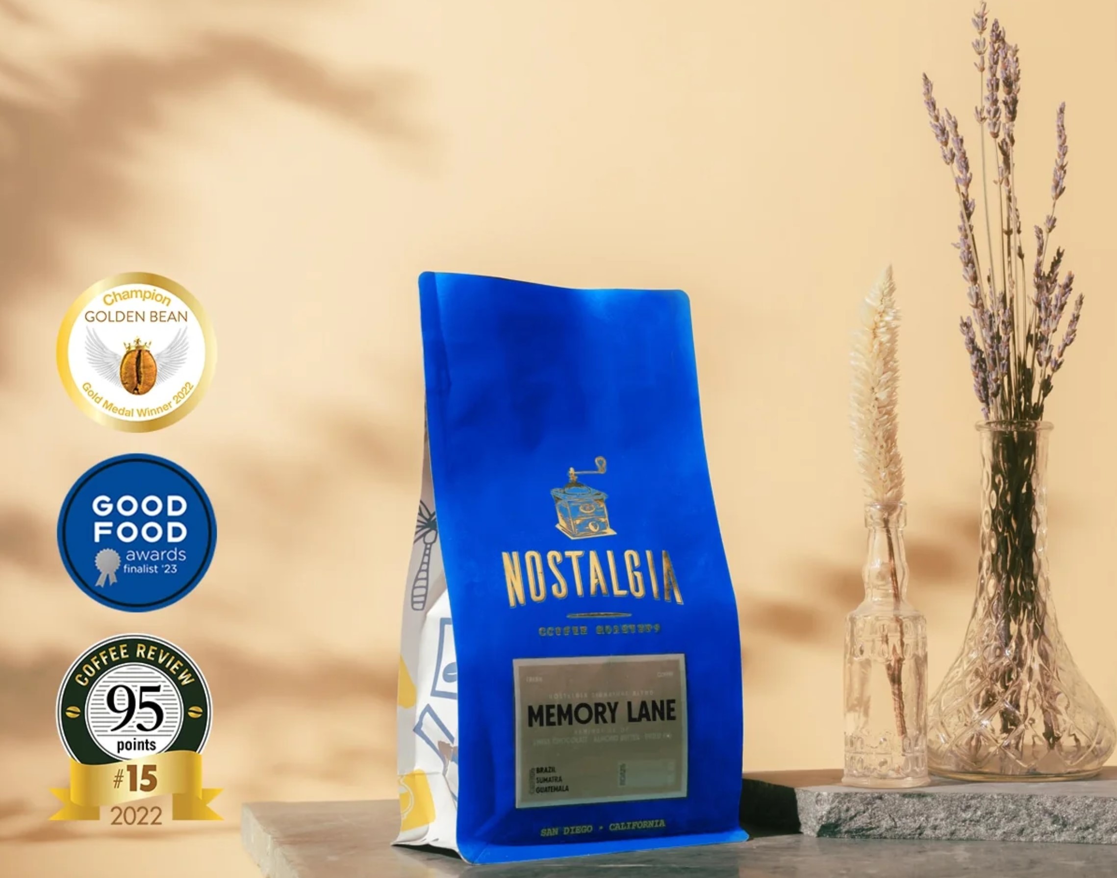
I didn’t know anything about roto printing bags until we met you all at Savor. I remember the first conversation we had with the team and remembering wow they really have the same exact vision for sustainability, and caring about people and the earth as we do. And so, we really put our trust and faith in Savor and I have to do that as a founder, and you know sometimes you learn hard lessons and other times like this relationship, it has opened new doors for us. It has launched our business, sustained our business, and pushed us further in newer better ways. So, the first time around we went with kraft and then we switched to polyester. The reasons why we went with roto was simple. The consistency, the vibrant color I’m looking at right now at our bag is absolutely gorgeous and the detail is exquisite. For us, the brand and our brand colors, our bags are the representation of everything that goes into that coffee, all the way down to the person opening it at home. And so, we made the initial investment although a little expensive up front and a little bit more time. We made the investment so that our bags will actually be cheaper than digital printing and more consistent, more bright, and going for that elegant style that we go for and it just nailed it. The price per piece is really important too as we are able to sell our bags at a more competitive price point even though our mission is working with producers to ensure our producers receive a thriving rate for their coffee and paying on average 2x the fair-trade price last year. Most consumers will then think the bags gotta be really expensive but we are able to compete with national brands because roto gave us the ability to have a much less costly 12oz bag that is more beautiful, consistent, brighter than anyone else’s bag. I am looking at the bag right now and am still so obsessed with it. I think those are some of the reasons, the fine details, the pantone color we are able to use and I believe we had to switch to pantone C which is so vibrant. Love it!


 3x SCA Best New Product Award Winner


