When Matte Meets Gold: Food & Custom Coffee Bags Built to Compete
/
When Matte Meets Gold: Food & Custom Coffee Bags Built to Compete
February 10, 2026
Savor Brands
reflective gold coffee packaging design
Ampersand Coffee Roasters
matte and gloss coffee bag printing
custom printed coffee bags shine
This Ampersand Coffee bag showcases how reflective gold print and matte finishes can work together to
create premium coffee packaging. Produced by Savor Brands, the bag combines shine, structure, and smart
materials to stand out on shelf while protecting product quality.
Gold That Grabs Attention: A Coffee Bag Designed to Shine
Packaging has to work fast to stop and intrigue shoppers while also communicate quality in just a few seconds. And that’s exactly what this Ampersand Coffee bag does. Produced by Savor Brands, this package utilizes transparent ink for its shiny gold effect against the dark matte layer to create contrast, depth, and shelf power.
This blog takes a close look at how smart material choices and premium print finishes come together to create a coffee bag that feels modern, refined, and competitive. The focus is simple: shine done right.
Built to Be Seen on Shelf
Retail shelves are packed with options. Color and design alone is no longer enough to help you jump out to potential customers. What makes this Ampersand Coffee bag stand out is the way light interacts with the surface. The reflective gold detailing and spot-gloss elements creates an eye-catching effect without overpowering the brand's logo.
The spot-gloss effect highlights key visual elements, including the botanical artwork and brand mark. Against the darker background, the shine creates a premium look that signals quality before the bag is ever picked up.
This approach helps the package rise above surrounding bags while still feeling refined and approachable.
Matte and Gloss Working Together
One of the strongest design choices here is contrast. The bag uses a matte varnish as the primary finish, giving it a smooth appearance. That matte surface sets the stage for spot gloss and reflective gold elements to shine even more.
By mixing finishes, the design gains depth and movement. The eye naturally shifts between matte and gloss areas, keeping attention focused longer. This layered look also helps the artwork feel dimensional rather than flat.
Key finish details include: Matte varnish for a clean, base cpat Spot-gloss to highlight select design elements Transparent ink - gold accents for visual impact
Materials That Support the Look and Function
Great design only works when the structure supports it. This coffee bag uses a high-quality material blend that protects the product while maintaining a premium appearance.
Material construction includes:
These layers help preserve freshness while providing strength and durability. The bag size measures 115mm (W) x 242mm (H) x 64mm (G), offering a balanced profile that stands well on shelf.
Functional Features That Add Value
Beyond looks, this bag is built for real-world use. Every detail serves a purpose, from storage to freshness to consumer convenience.
Functional features include:
Resealable BP zipper placed 44mm from the top
Rounded corners for a smoother feel, cleaner edges, and a modern look
Interior wallpaper for a finished, high-end bespoke look + customer surprise
Degassing valve WB (W009) to release gases and protect flavor
Together, these features enhance usability while reinforcing the premium positioning of the brand.
Trend-Forward Packaging by Savor Brands
This project reflects Savor Brands’ commitment to quality and trend-aware design. The use of reflective gold, layered finishes, and thoughtful structure aligns with current premium food and coffee packaging trends. At the same time, it avoids overdesign, keeping the focus on clarity and shelf impact.
The result is packaging that feels current, competitive, and built to perform in retail environments.
Why Shine Matters in Coffee Packaging
Shine isn’t just decorative. When used with intention, it becomes a strategic tool. Reflective elements catch light, guide attention, and help shoppers notice details they might otherwise miss. On this Ampersand Coffee bag, gold shine does exactly that. It elevates the brand without distracting from it.
This balance is what makes the design successful.
Need help taking your current design to the next level? Contact our team today to see how we can help enhance your current packaging design!
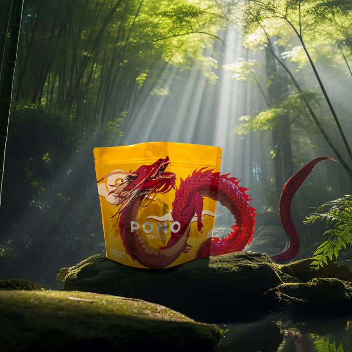
Shine With Purpose, Perform With Pride This first entry in our series celebrates a bag that still feels modern. The PONO 2015 holographic design from Savor Brands turned heads, told a story, and backed it up with function. Next up, we will explore more ways holographic finishes can elevate coffee p...
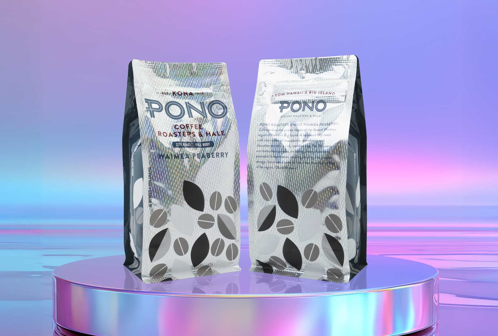
Pono & Savor Brands: Where Innovation and Heritage Meet in Packaging A Platform for Innovation The Pono Bags are not your average coffee packaging. They are a canvas for innovation, featuring: New materials that enhance durability, freshness, and sustainability Trend-setting shapes and d...
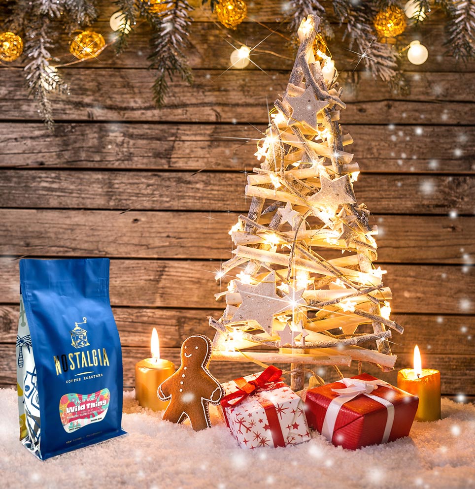
Coffee Sales Shine Bright in December December is a golden month for coffee sales. With holiday shopping in full swing, coffee gifts appeal to a broad range of consumers. According to industry stats, coffee sales often see a notable spike during this time of year, with holiday-themed products drivin...
The Knockout Foil Coffee Bag That Started It All The knockout, or cut out to foil, technique is a coffee bag printing method where certain parts of the design are intentionally left unprinted so the metallic foil layer underneath becomes visible through the ink. In Bluebeard Coffee’s pioneering ex...