You Approved One Color and Got Another
It is one of the most common surprises in custom packaging. You sign off on a design that looks bright and perfect on your laptop, and when the printed bag arrives the color feels slightly different. Maybe the blue is calmer, the red leans darker, or the green lost a little life. The frustrating part is that nobody made a mistake. The color on your screen and the color on your bag were never going to match on their own, because they are made in two totally different ways. Once you understand that, color stops feeling like a gamble and starts feeling like something you can plan for.
RGB vs CMYK: Light Versus Ink
The core of the whole issue is RGB versus CMYK. Your screen builds color out of light, and printed packaging builds color out of ink, and those two systems simply do not have the same range.
- RGB stands for red, green, and blue light. Screens mix those three lights to create every color you see, and because light is bright and adds up, screens can glow. That is how you get an electric blue or a neon green that looks lit from inside.
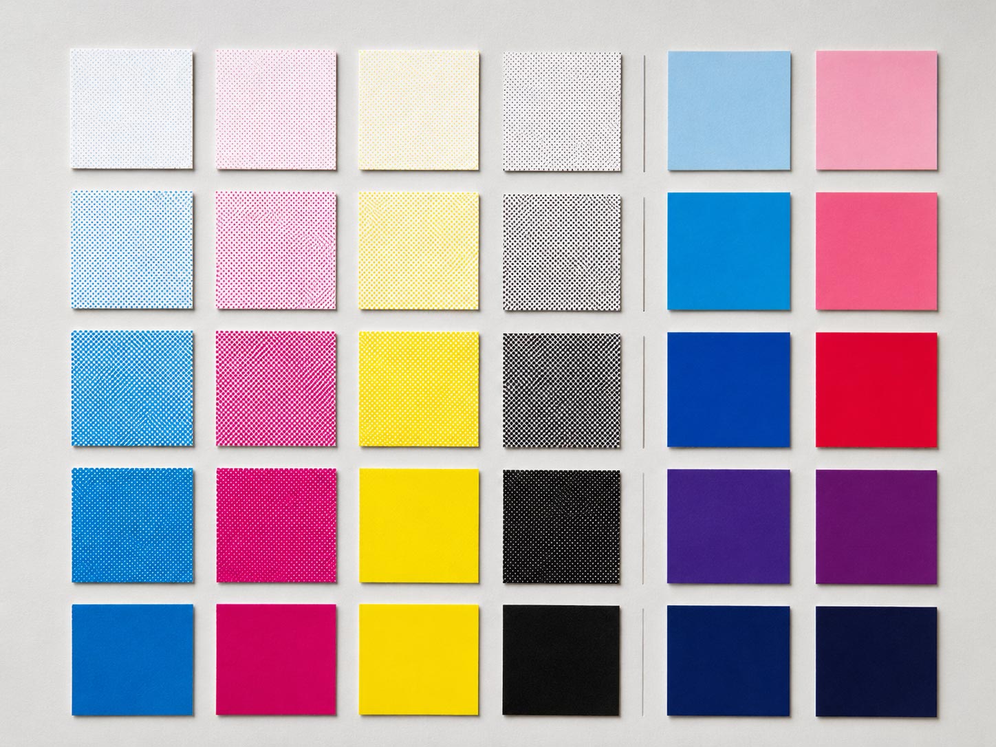
- CMYK stands for cyan, magenta, yellow, and black ink. Print builds color by laying ink on a surface that absorbs some light and reflects the rest. Ink cannot glow, so it can never reach the brightest colors a screen can show.
When your RGB design is sent to print, every glowing screen color has to be translated into a mix of those four inks. Most colors convert well. The very brightest, most saturated ones often cannot, and that gap is where a lot of color disappointment lives. This is the print side of the story, and our guide on
why coffee bag color looks wrong and how to get it right covers how to lock in your printed color with Pantone and proofs.
Why the Same File Looks Different on a Mac and a PC
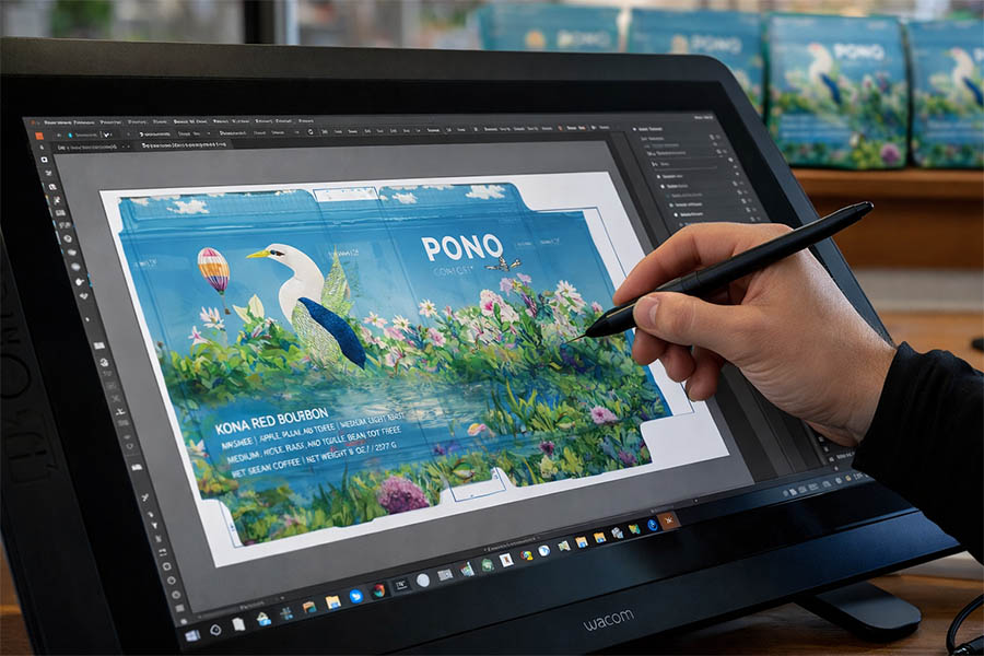
Here is the part most people miss: the deception starts before print, on your own screen, and it gets worse when you compare screens. The same design file can look noticeably different on a Mac and a PC, and it is not your imagination.
The old story was that Macs and PCs used different gamma settings, but that gap closed years ago. The real reason today is the display itself. Most modern Macs ship with wide-gamut Display P3 screens, which can show richer, more saturated reds and greens. Most PCs use standard sRGB screens with a narrower range. Put the same bag design on both and the Mac often looks punchier while the PC looks more reserved. Even when both machines use the same color profile, differences in how each system manages color can still nudge the result.
- Modern Macs use wide-gamut Display P3, so colors can look more vivid
- Most PCs use narrower sRGB, so the same file can look flatter
- The file did not change, only the screen showing it did
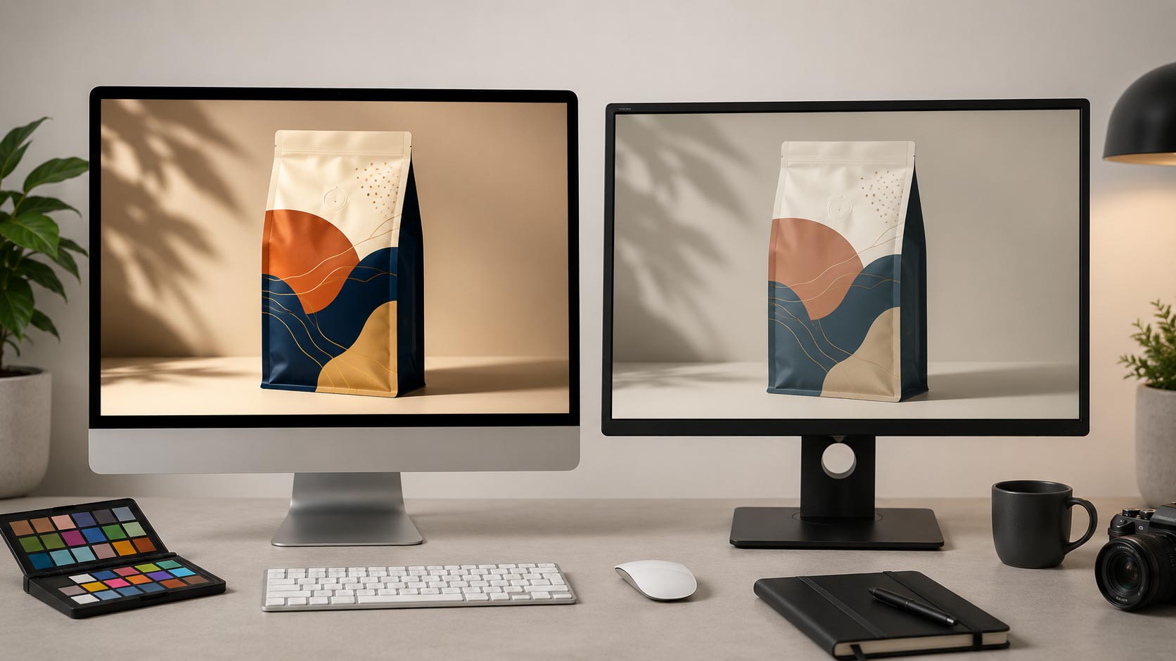
Your Monitor Might Be Lying to You
On top of the Mac and PC difference, your own monitor may not be telling the truth. Screens ship at different default brightness levels, they drift over time, and a bright, punchy factory setting can make everything look more saturated than it really is. If you have ever designed something at full brightness late at night and wondered why it looked muddy the next morning, you have felt this firsthand. An uncalibrated screen is a moving target, so judging an exact brand color on it is risky. The screen is a great place to design and a poor place to make a final color decision.
How to Stop Being Fooled by Your Screen
You cannot make every screen agree, but you can stop letting your monitor make the final call. A few habits remove almost all of the guesswork.
- Calibrate your monitor, or at least set it to a standard brightness, so it is a steadier reference
- Know your color space, and design in the mode that matches your goal, then soft-proof to preview how the print will look
- Define your brand color as a specific Pantone number instead of trusting the on-screen shade
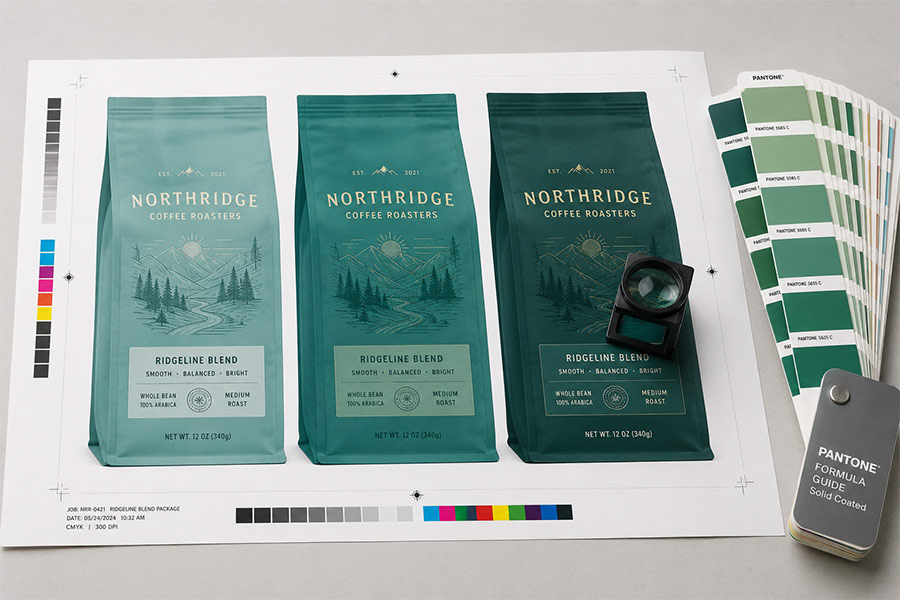
- Always get a printed proof on your real bag material before a full run, especially for a critical brand color
The takeaway is simple: use your screen to design and a physical reference to decide. A Pantone chip and a press proof are the only colors that do not change from one device to the next.
Quick Answers on Screen and Print Color
Is RGB or CMYK better for packaging? Neither is better, they are for different things. Design and screens live in RGB, but print lives in CMYK, so your artwork has to be prepared for CMYK printing to look right on the bag.
Why does my bag look different than my screen? Screens make color with light and can glow; ink cannot. The brightest screen colors simply cannot be reproduced in ink, so they shift when printed.
Why do the same colors look different on my Mac and my PC? Mostly because modern Macs use wide-gamut Display P3 screens while most PCs use narrower sRGB, so the Mac shows more saturated color even though the file is identical.
How do I know what my color will really look like? Do not rely on any single screen. Use a Pantone reference for your brand color and get a printed press proof on your actual bag material before the full run.
Should I calibrate my monitor? If color matters to your brand, yes. A calibrated screen at standard brightness is a far more trustworthy reference than a bright, uncalibrated one.
Design on Screen, Decide on Paper
Your monitor is a wonderful design tool and an unreliable judge of final color. Once you understand that RGB light and CMYK ink live in different worlds, and that no two screens fully agree, the fix is easy: design freely on screen, but make your final color call from a Pantone chip and a real printed proof. Do that, and the bag you approve is the bag you get. When you are ready to bring your artwork to life on
custom coffee bags, our team helps you nail the color from
digital to
rotogravure.