The Complaint That Has No Culprit
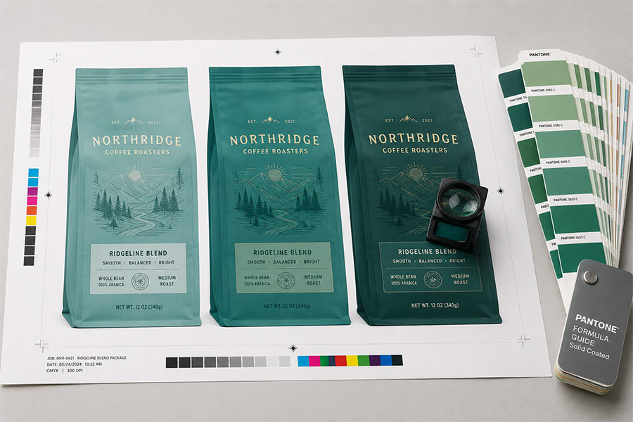
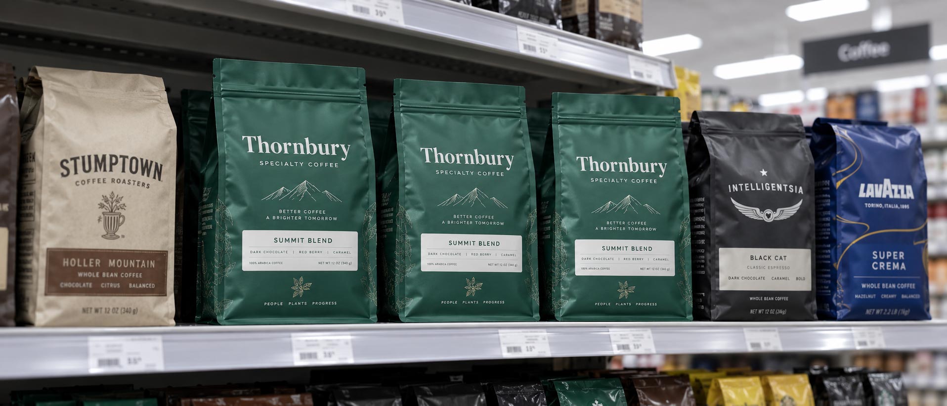
Your bag arrives. On your desk, next to the approved proof, it matches. You sign it off, ship it to a grocery account, and two weeks later someone sends you a photo from the aisle and the green has gone grey.
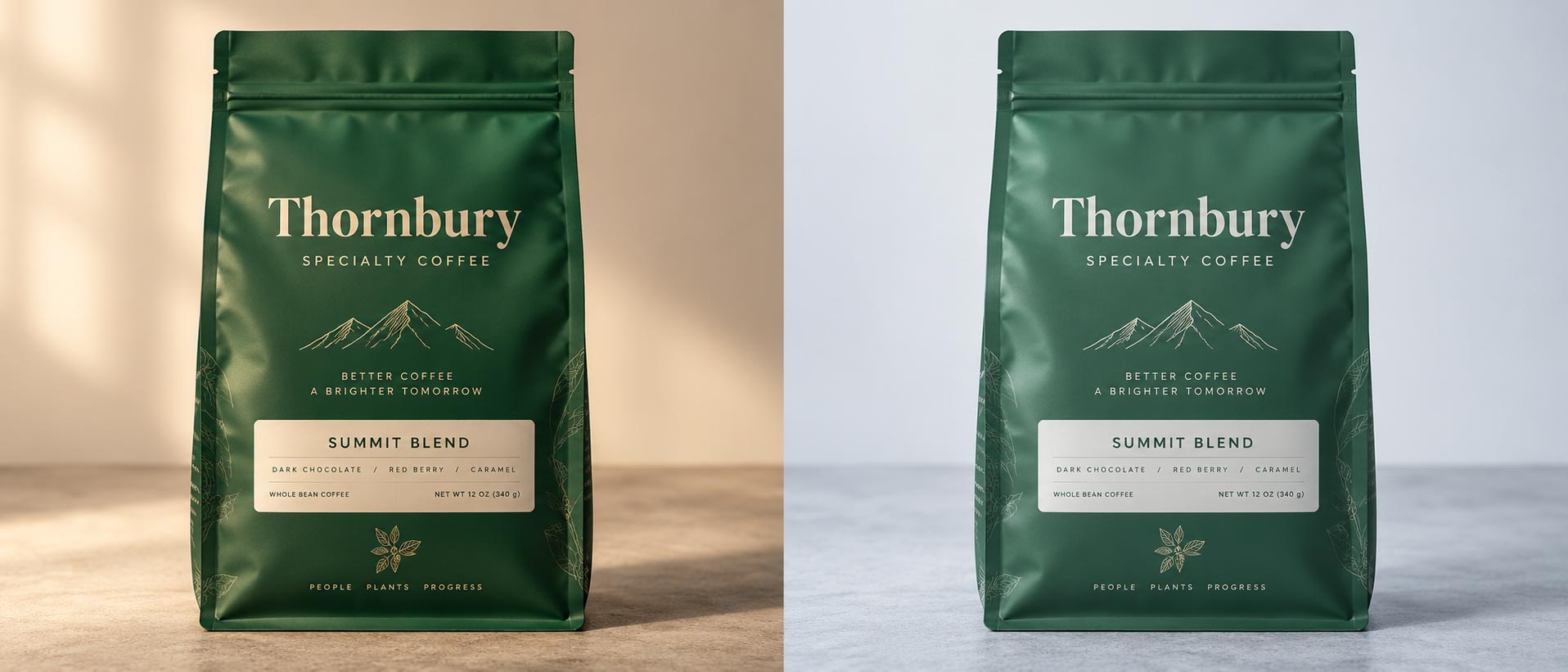
Nothing was reprinted. Nothing shifted at the press. The bag in that photo is the same bag sitting on your desk. What changed is the light it was standing under.
This is a real and well documented effect with an unhelpful name: metamerism. Two colors that match under one light source and stop matching under another. It is the one colour problem where everybody involved did their job correctly and the result is still wrong.
Why It Happens
Colour is not a property of an object. It is what happens when a light source hits a surface and the surface sends some of that light back at you.
Change the light source and you change the input to that equation. A north-facing window, a warm studio lamp, a supermarket fluorescent tube and a modern LED all emit very different mixtures of wavelengths. A surface that reflects a particular blend can look identical to another surface under one mixture and visibly different under a second.
That is why two greens can agree perfectly on your desk and disagree on a shelf. They were never the same green. They were two different recipes that happened to land on the same appearance under the one light you were both standing in.
This Is Not the Usual Colour Problem
Worth separating clearly, because the symptom sounds identical to a much more common issue.
Most colour complaints come from the chain between your screen and the press: RGB versus CMYK, an uncalibrated monitor, the film underneath changing how ink sits. We covered that whole chain in
coffee bag color matching and the screen half of it in
RGB versus CMYK. In those cases something genuinely differs between what you approved and what was made.
Metamerism is the opposite situation. The bag and the proof are the same. The press was accurate. Your file was right. The mismatch only exists in a particular room, under a particular lamp, and it will vanish if you carry both outside.
Knowing which of the two you are looking at matters, because the fixes are completely different. One is a production conversation. This one is a specification conversation, and it happens before anything is printed.
Where Coffee Bags Get Caught
A few situations make this far more likely, and coffee packaging hits several of them at once:
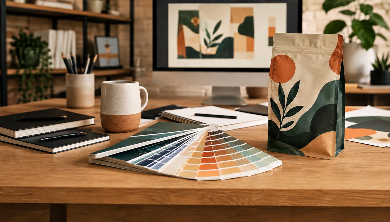
- Matching a brand colour across two materials. The same target hit on a matte film and on kraft paper is two different ink recipes on two different substrates. That is the classic setup for a metameric pair, and roasters do it constantly across a lineup.
- Matching a bag to something that is not a bag. Your box, your labels, your cups, your tissue. Different processes and different stocks, all aiming at one brand colour.
- Mixed colour builds. A colour built from process inks and the same colour hit as a spot are reached by different routes, so they can diverge under a light neither was checked in.
- Retail lighting you never see. You approve in a studio or an office. The bag lives under whatever the account installed, which is frequently cool, high-output and nothing like your desk.
What Actually Prevents It
The good news is that this is cheap to avoid and expensive to discover late.
- Approve under more than one light. The single most useful habit on this list. Look at the proof by a window, under your office lighting, and if you can, under the kind of lighting your main account uses. If it holds in all three, you are fine. If it moves, you have found the problem while it is still free to fix.
- Specify a colour rather than an appearance. A named target that both sides can measure removes the argument entirely. Our post on colour matching covers what a Pantone reference actually does for you here.
- Ask for the match to be checked on your actual substrate. Not on paper, on the film or the kraft you are really running. Same discipline as testing a date code on real material rather than assuming.
- Be realistic across a lineup. If one roast is on kraft and another on white film, aiming for a perfect match on a shared accent colour is the hard version of this problem. Sometimes the better answer is to let the substrate show and choose a palette that works on both.
Check the Light Before You Blame the Print
If a bag looks wrong in a store, carry it outside before you call anyone. If the colour comes back in daylight, nothing failed in production, and a reprint would produce exactly the same bag.
What you do next is a design decision, not a manufacturing one. Either the palette needs to be more forgiving across materials, or the colour needs to be specified tightly enough that it is measured rather than eyeballed, or both.
If you are picking a brand colour that has to hold across bags, boxes and labels,
talk to our team before the palette is locked. It is a far easier conversation than the one that starts with a photo from a supermarket aisle.