The Proof You Approved Was Flat
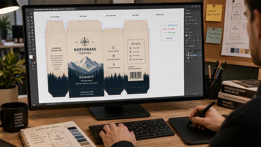
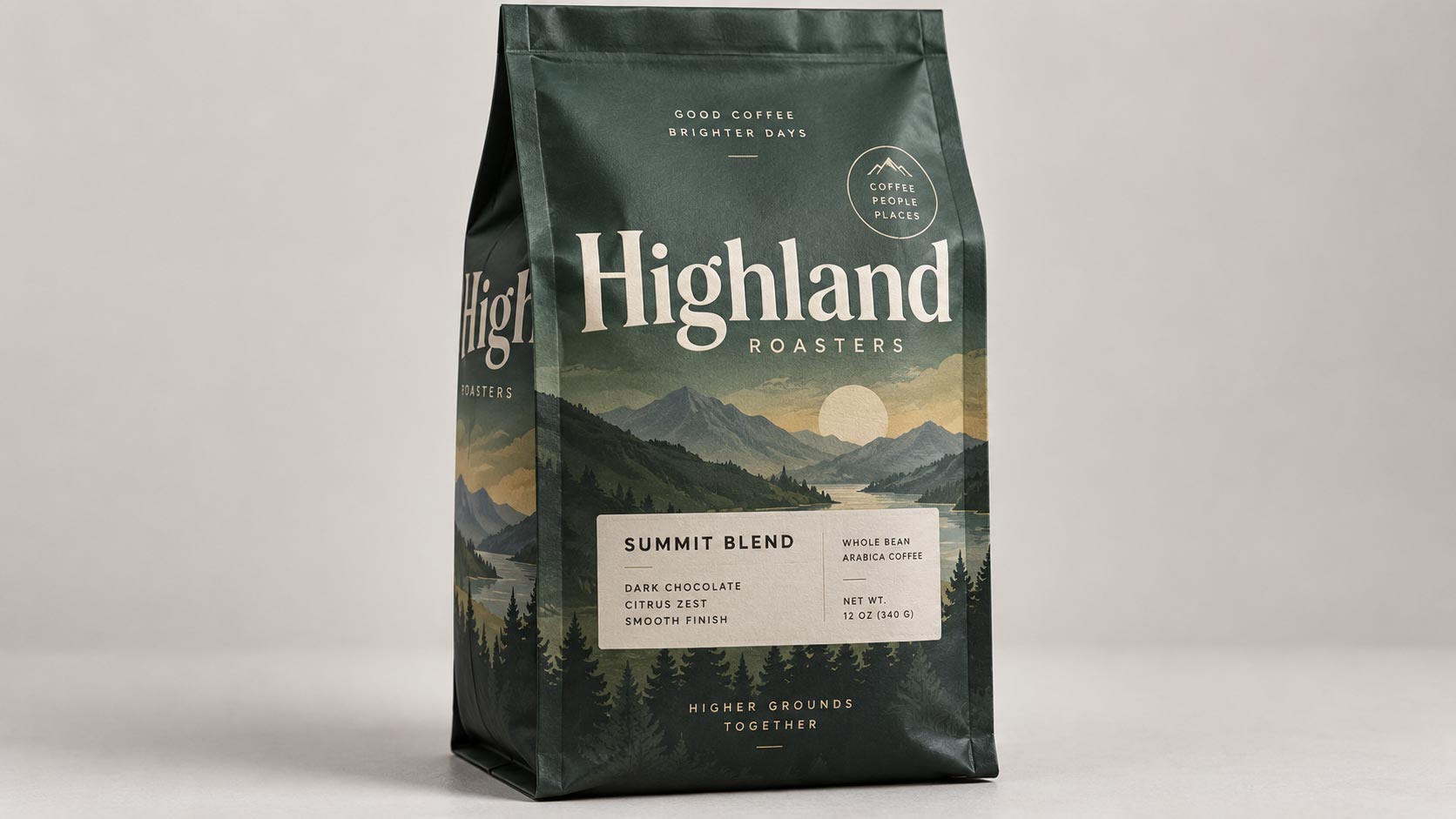
Every coffee bag design starts life as a rectangle. You open a dieline, you lay out your artwork inside it, you look at it on a screen, and you approve it. Everything lines up. The logo is centered, the type is balanced, the origin sits neatly above the weight.
Then the bags arrive, your team fills them, and the first one goes up on the shelf. The logo is not quite centered anymore. Part of your tagline has folded around a corner. The bottom of your design has vanished somewhere underneath the bag.
Nothing went wrong at the printer. The artwork printed exactly as approved. What changed is that a flat sheet became a three dimensional object, and nobody warned you that your design has to survive that transition.
Where the Front Panel Actually Goes
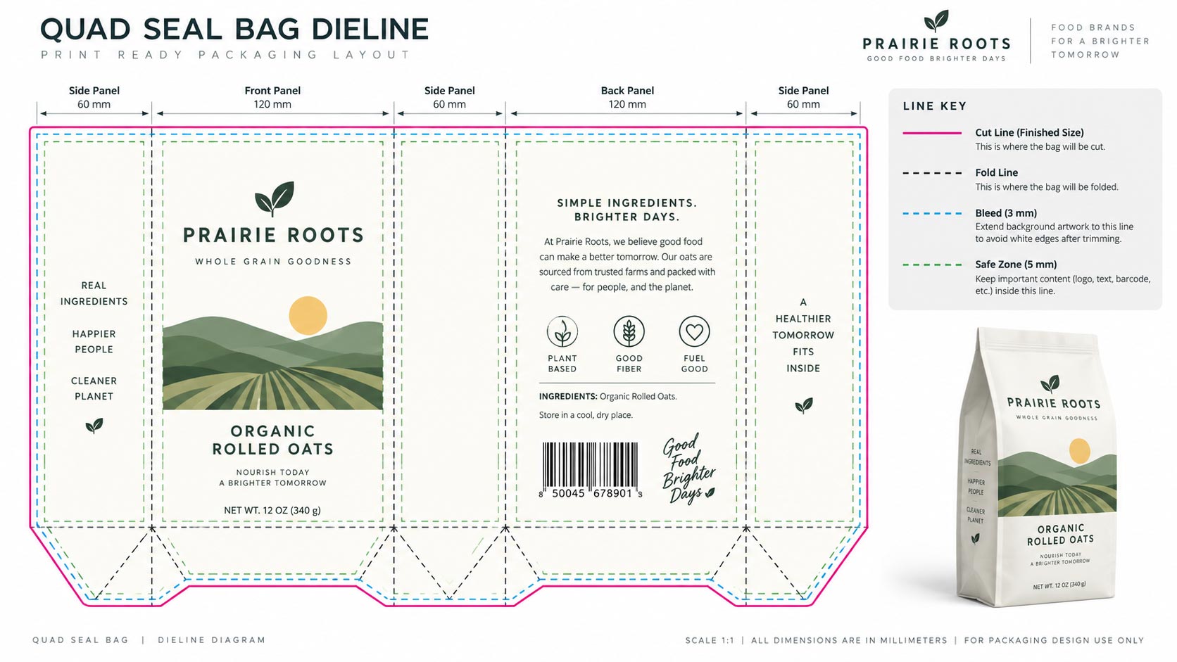
A dieline shows total printable width. That is not the same as the width your customer sees.
Take a quad seal box bottom bag. Flat, it is one wide rectangle. Filled, it becomes a box: two side gussets open outward to give the bag depth, and the base folds down to make it stand. The film that forms those gussets and that base came from somewhere, and it came from the width and height of your flat artwork.
So the panel facing your customer head-on is meaningfully narrower and shorter than the rectangle you designed in. Anything you placed near the left or right edge is now angled away on a gusset, visible only from the side. Anything near the bottom edge has curled underneath. Our
guide to packaging dielines covers what the file itself contains, and this is the part that file does not tell you: which of those areas a shopper will actually be looking at.
Four Things That Move When You Fill a Bag
Once you know to look for them, these are predictable and easy to design around:
- Centered artwork drifts off center. The geometric center of your flat file is not the visual center of the filled bag, because the gussets take unequal-looking bites out of each side once the bag has depth and shadow.
- The bottom of your design disappears. On any bag with a formed base, the lowest band of artwork rotates under the bag. Put your web address down there and nobody will ever read it.
- Type crossing a fold breaks. A gusset crease is a hard edge. A word running across it does not curve gracefully, it snaps, and small type can lose an entire letter into the fold.
- Wide artwork reads narrower. A filled bag is a curved surface. A long word spanning the full face has its first and last letters turned away from the viewer, so it reads cramped even though it is technically the right size.
The Safe Zone Is Not the Bleed
Most files respect bleed and stop there, because bleed is the requirement everyone knows. Bleed exists for the cutter: extend your background past the trim so a slight drift does not leave a white sliver. It is about manufacturing tolerance.
A safe zone is a different thing solving a different problem. It is the region that stays flat, forward and visible after the bag is formed and filled. Bleed protects you from the blade. The safe zone protects you from the fold.
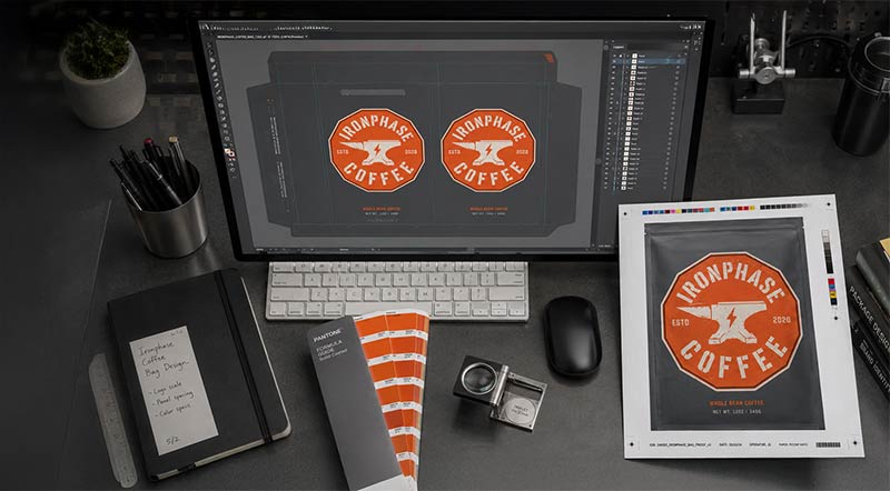
They are separate margins and you need both. A file can be perfectly print ready by every technical measure in our
print ready artwork checklist and still put your logo somewhere the customer cannot see it.
What Belongs Inside the Safe Zone
Anything that has to be read, scanned, or recognized from directly in front of the bag:
- Your logo and brand name.
- The product name, origin and roast level.
- Net weight, and any legally required declarations.
- The barcode, which needs to sit flat to scan reliably. A barcode on a curve or across a crease is a barcode that gets keyed in by hand at the register.
- Certification marks, if a buyer needs to see them at a glance.
Things that are fine outside it: background pattern, texture, color fields, decorative illustration, and copy you are happy for people to find only when they pick the bag up and turn it.
We are not going to print a specific margin here, because the honest answer is that it depends on the bag style, the size and the film, and a number invented for a blog post is worse than no number at all. Take it from the dieline for your exact bag, or ask us and we will mark it up for you.
Where Each Bag Style Costs You
The amount you lose to forming is not the same across formats, and it is worth knowing before you commit to a style:
- Quad seal box bottom. The most structure and therefore the most loss. Two gussets plus a formed base. Beautiful on shelf, least forgiving with edge-to-edge artwork.
- Side gusset. Classic coffee look, deep gussets, and a narrow front face relative to its flat width. Design tight to the center.
- Stand up pouch. A bottom gusset rather than side gussets, so you keep more of your width but lose a band at the base.
- Tri-seal pillow pouch. The flattest of the group and the most predictable. What you design is close to what you see, which is part of why it suits sample and single-serve sizes.
How to Actually Check It
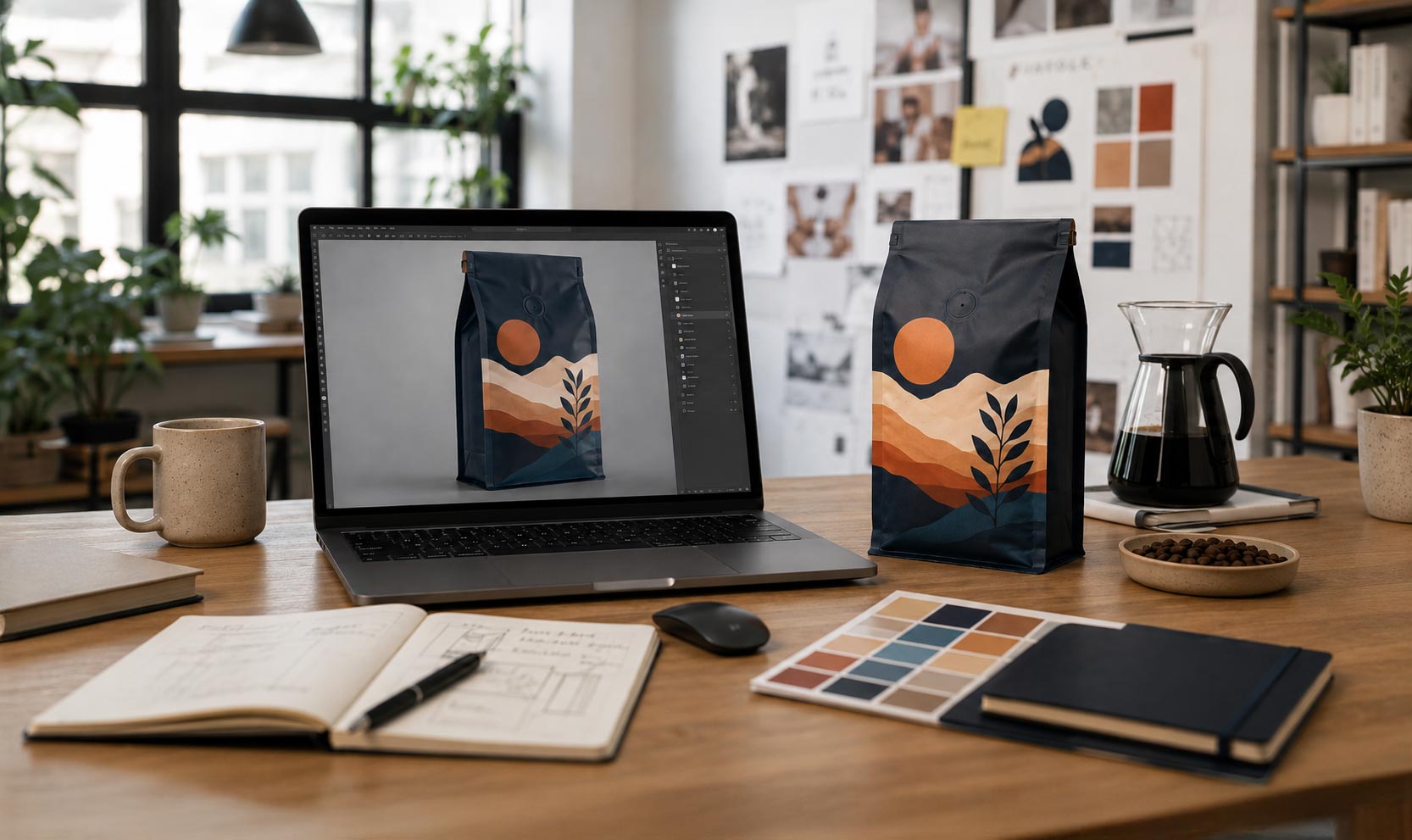
You cannot catch any of this on a flat proof, and you cannot fully catch it on a digital mockup either, because a rendered mockup is someone's approximation of how the bag will form.
The only reliable check is physical. Get a pre-production sample in the exact style and size, and then
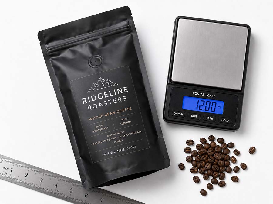
fill it with your own coffee at your actual weight. Whole bean at 12 oz sits differently than ground at 12 oz, which is the same reason a
fill test matters in the first place. Stand it up, put it at arm's length, and look at it the way a customer in an aisle will. Then check the barcode with a real scanner.
Our post on
mockups, proofs and pre-production samples lays out which stage catches what. This particular problem lives almost entirely in the last stage, which is exactly why it is the stage people skip.
Design for the Object, Not the File
None of this is a reason to be timid with your artwork. Bold, edge-to-edge design is what makes a bag look confident on a shelf, and the bags that win are rarely the cautious ones.
It is a reason to know which parts of your canvas are load bearing. Put the things that have to be read where they will stay flat and forward, let the decoration run wherever it likes, and check the whole thing on a filled bag before you approve a run. If you are briefing a designer, this belongs in the brief from day one, which is covered in
how to brief a designer for coffee bag artwork.
If you are working on
custom coffee bags right now and you are not sure how much of your front panel survives the fold,
send us your artwork and we will show you on the dieline before anything goes to press.