What Is the Line Across the Front of My Coffee Bag?
It is the zipper. A press-to-close zipper is two plastic strips, one with a rib and one with a groove, and each strip is welded to the inside of the bag, one to the front panel and one to the back, a little below the top. You never see the strips themselves. You see where they are.
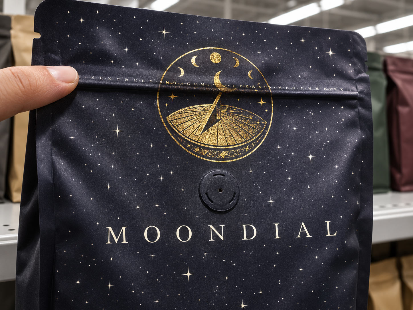
From the outside, the zipper shows up as a faint raised ridge running straight across the front of the bag. Run a finger across the panel and you can feel it. Under a store light it catches a thin highlight on top and a thin shadow underneath. On a matte or soft touch bag, the band where the zipper was heat sealed can also look very slightly different from the film around it, because the heat and pressure that weld the strip also touch the surface.
None of that is a defect. Every resealable bag has it. The only question is what your artwork is doing at that height.
Why Does My Artwork Look Wrong at the Zipper?
Because the ridge, the shadow and that sealed band all land on whatever is printed there. Most of a coffee bag is flat, so the art reads cleanly. One stripe of it is not flat, and anything fine or important on that stripe pays for it.
- Small text and thin lines look bumpy. A tagline or a roast date set right on the zipper height rides over the ridge. On the shelf it reads as a wobble or a broken line.
- The edge of a logo picks up a shadow. If the top of a crest or the middle of a wordmark sits on the zipper, that part of the logo looks darker than the rest, as if it were printed badly.
- The zipper does not sit on an exact hairline. It is placed during bag making, a step after printing, so its final position can drift a little from bag to bag. A line of text designed to sit just above it can end up crossing it on some bags and not others.
- Anything above the zipper usually gets torn off. The tear notch sits above the track, so whatever is printed in that top strip is removed the first time the bag is opened.
Isn't That a Printing Problem?
Almost never. This is the part most roasters get wrong. They see a bumpy tagline or a shadowed logo, decide the printer did a poor job, and ask for a reprint. The reprint comes back with the same line in the same place, because the print was never the problem. The bag has a ridge at that height, and the art was placed on it.
The good news is that it is completely in your control, and the fix costs nothing. It happens in the layout, before anything is printed.
How Do I Keep My Artwork Off the Zipper Line?
Treat the zipper height as a band with its own rules, the same way you already treat the seals and the folds.
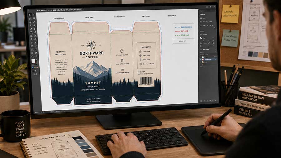
- Find the zipper on your dieline first. Before the designer places a single element, mark where the zipper runs across the front and back panels. If the position is not clear on your file, ask. Our packaging dieline guide explains how to read one.
- Keep a clear band around it. No small text, no thin rules, no barcodes, no faces and no logo edges in that band. Give it comfortable room above and below, so the normal drift in zipper position still lands in empty space.
- Let color and pattern run through. A solid background, a gradient or a loose pattern can cross the zipper with no trouble. The ridge only shows when it cuts through detail.
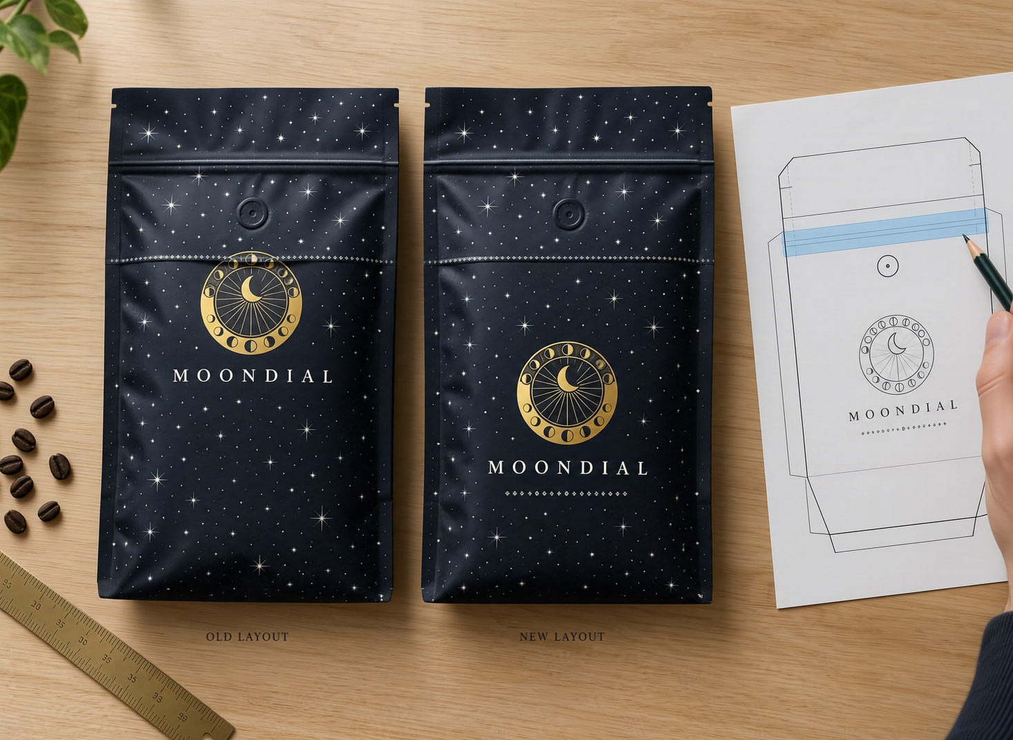
- Drop the logo below the zipper. The best real estate on a coffee bag is the open panel under the zipper, which is also where the eye lands on a shelf. Set the logo there with breathing room, rather than squeezing it up toward the top.
- Keep the top strip for things you can lose. Anything above the zipper is likely to be torn away, so use it for color or a simple pattern, never for the brand name, the roast date or anything a customer needs after opening.
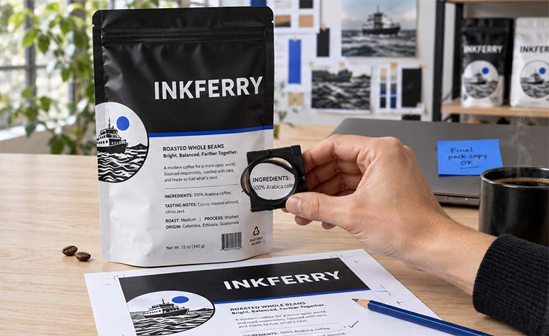
- Look at it under store light. Check a printed sample under a bright overhead light, tilted the way a shopper sees it, and look straight across the zipper height. If something there catches a shadow, move it.
How Savor Brands Checks the Zipper Line
We would rather catch this on a screen than have you find it on your shelf, so the zipper is part of the artwork check, not an afterthought.
- You get the right dieline from the start. Once your bag size, style, material, zipper type and valve placement are confirmed, we send the Adobe Illustrator dieline, so your designer builds the art around where the zipper really goes.
- We check your artwork in prepress. If fine text, a barcode or the edge of a logo sits on the zipper height, we flag it and suggest where to move it before anything goes to press.
- You see it on a digital proof. Your print-ready file is laid onto your exact dieline, so you can see the zipper line against your design and make changes while they still cost nothing. Our post on coffee bag mockups and proofs covers what to look for.
- You can hold a real bag first. Packaging samples let you feel the zipper ridge and look at it under your own lights, and short runs on digital printing keep a first custom order small.
Wrapping It Up: Design Around the Line
The line across your coffee bag is the zipper, and it is supposed to be there. It is a raised ridge, it catches light and shadow, and its position moves a little from bag to bag. Fine detail that lands on it looks wrong, and a reprint will not change that. Moving the art will.
Find the zipper on the dieline, keep a clear band around it, let only color and pattern cross it and set your logo in the open panel below. For more on keeping fine copy crisp, see
why small print on coffee bags blurs. If your current bags have a logo or tagline sitting on the zipper,
send us a photo and we will help you rework the layout for your next run of
custom coffee bags.