Two Bags, One File, Two Results
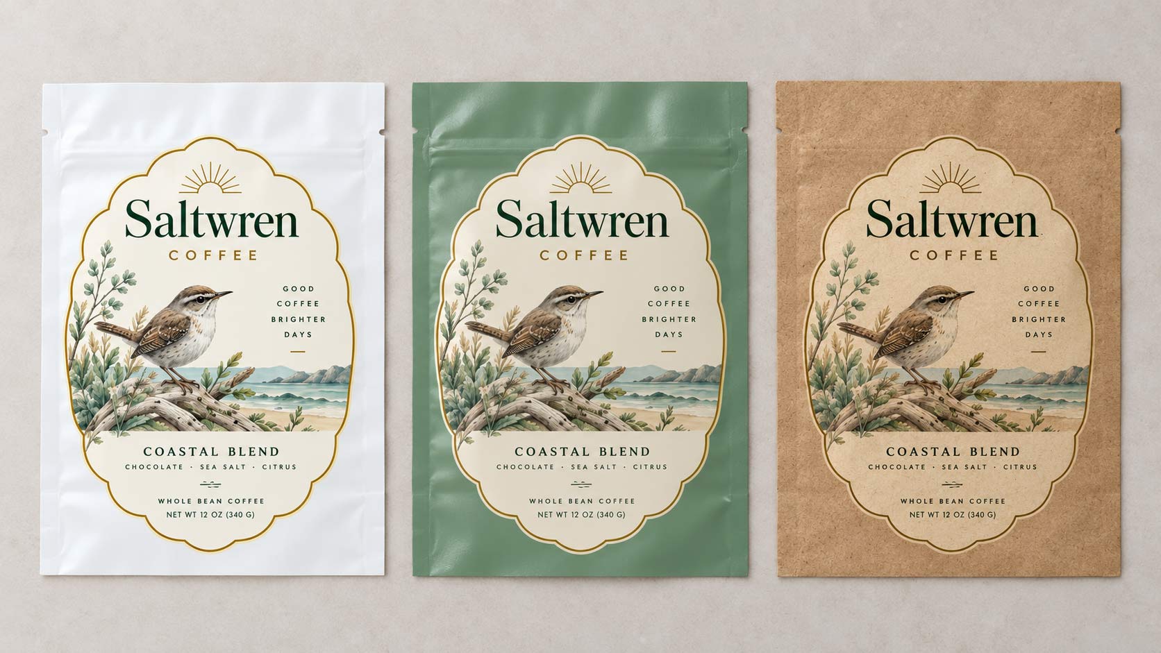
A roaster sends us the same artwork twice. Once for a conventional high barrier bag, once for a compostable one. The files are identical. The bags are not.
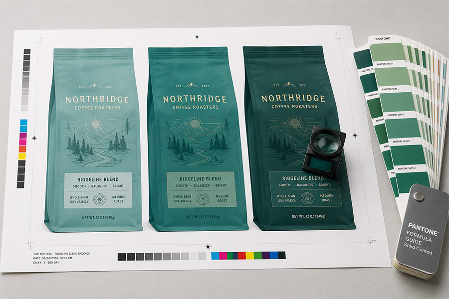
The compostable version comes back warmer and softer. The whites are not as bright. A pale sage green reads a little more olive. Nothing is wrong, nothing failed, and no one made a mistake.
Two things changed underneath the artwork, and neither of them is the artwork.
What Is Actually Different
Our
Compost+ line is not a conventional bag with a different certificate stapled to it. It is a different material printed a different way, and that shows up in the colour.
- The substrate is not optically bright. Compost+ comes as an industrial compostable laminate film certified by DIN CERTCO, and as compostable kraft, which is an industrial compostable paper with a visible texture. Neither one is the brilliant white or mirror-bright foil that a conventional structure gives your ink to sit on.
- The inks are a different set. Compost+ prints with compostable, toxin-free inks, because an ink that will not break down would defeat the point of a bag that does. A different ink chemistry lays down a slightly different colour than the conventional set.
- It is printed digitally. Compost+ runs on our digital process, which is what keeps the minimums low. If your other bag was printed rotogravure, you are comparing two different presses as well as two different materials.
So when the compostable bag looks different, you are not looking at a printing error. You are looking at three deliberate choices stacked on top of each other.
Why Paper Changes Everything Above It
Ink is not paint. Most of what you see is light passing through a thin layer of ink, hitting whatever is behind it, and coming back to your eye. That backing is doing half the work.
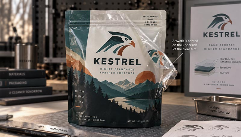
On a conventional laminated bag, the ink is buried under the outer film and usually sits on a layer of opaque white or metallized foil, which we covered in
reverse printed coffee bags. That white is there precisely to give the colours a clean, bright base.
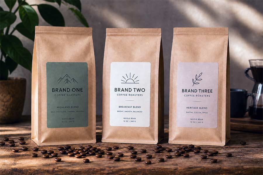
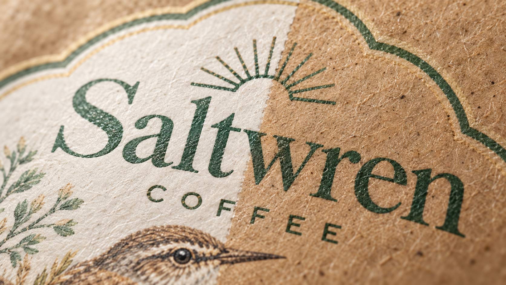
Kraft gives them a warm brown base instead. Every colour printed on it picks up some of that warmth. Yellows go golden, blues go slightly muted, and white ink becomes a real decision rather than an afterthought, because white is the one colour that cannot come from the paper. Our
guide to kraft coffee bags covers how those structures are built.
This is not a flaw. It is the reason kraft looks like kraft. People choose it because it reads natural and handmade, and that look comes from exactly the same property that shifts your colours.
What to Do About It
None of this is a problem if you decide it on purpose instead of discovering it on a pallet.
- Proof on the real material. A proof on conventional stock tells you almost nothing about how the job will look on compostable kraft. Ask to see it on what you are actually buying.
- Decide where you want white. An opaque white layer behind part of your artwork gives you bright, true colour in those areas. Leaving it off lets the kraft show through. Both are valid, and choosing deliberately is how you get a design that looks intentional.
- Design with the substrate, not against it. Artwork built for a warm textured base tends to beat artwork built for white and then moved across. Earthy palettes, strong line work and bold type all hold up well on kraft.
- Do not expect a match across your line. If some SKUs are conventional and some are compostable, they will not be identical twins. Aim for a family that clearly belongs together rather than a match that the materials cannot deliver.
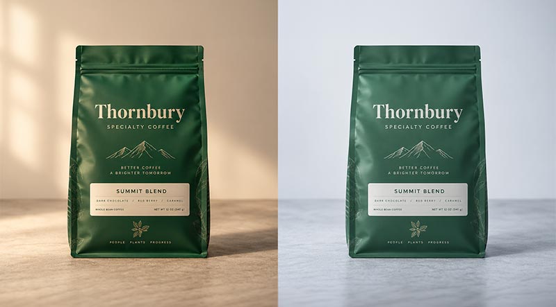
- Look at it in the room where it sells. Substrate is one thing that moves colour. Store lighting is another, which is the subject of this post on metamerism.
The Conversation Worth Having Early
The moment to raise this is before the artwork is finished, not after the first run lands.
If you tell us at the start that a SKU is going compostable, the design can be built for it. If you tell us after a conventional version has already been approved and printed, we are trying to chase a colour onto a material that will not quite hold it, and that is a frustrating way to spend a proof cycle.
It is the same principle as everything else in
getting your bag colour right. The earlier the material is known, the fewer surprises reach the shelf.
Why It Is Worth Knowing
Compostable packaging gets sold on its end of life, and that is fair, because that is the point of it. What almost nobody explains is that it is also a different canvas.
It is worth knowing for three reasons. It stops you reading a normal material difference as a printing defect. It lets you design for the bag you are actually buying instead of adapting late. And it means the sustainability decision is made with clear eyes, which is the only way it lasts.
If you are considering a compostable version of a bag you already run,
send us the artwork and we will tell you which colours will travel across and which ones need rethinking.