What Print Ready Actually Means
Print ready is one of those phrases everybody uses and almost nobody defines. To a designer it usually means the artwork looks finished. To a press it means something much more specific: the file is built so that a machine can reproduce it exactly, on the right material, in the right spot, with nothing left to interpretation. Those two definitions are not the same, and the gap between them is where most packaging delays live.
The good news is that the gap is small and completely fixable if you know what is on the list. Every file that comes through our quote form goes through a preflight check before it reaches design review. Some things are hard requirements and will send your file back. Others are flagged for a person on our design team to look at rather than bouncing automatically. Knowing which is which lets you clear the hard list before you submit and stop guessing about the rest.
The Hard Requirements
These six are the automatic holds. If any of them are not met, we follow up with next steps before moving forward, which means your project is sitting still until the file comes back corrected. None of them are difficult, but all of them are easy to miss if nobody told you they mattered.
- Artwork on the correct layer. Your design belongs only on the designated Artwork layer of the template. A modified layer structure means we have to issue a new template.
- All text converted to outlines. Fonts need to be outlined, or converted to curves, so there is no font substitution risk at print. A font that looks right on your machine is not necessarily on ours.
- Transparency flattened. Any transparency effects need to be flattened before submission, because unflattened effects can render unpredictably on press.
- Images embedded, not linked. Every image must be embedded directly in the file rather than linked, in CMYK color mode, at 300 PPI minimum. A linked image is a file we do not have.
- Spot colors as Pantone Solid Coated. If you are using spot colors they need to be specified as Pantone Solid Coated, not Uncoated, not CMYK, and not Metallic equivalents.
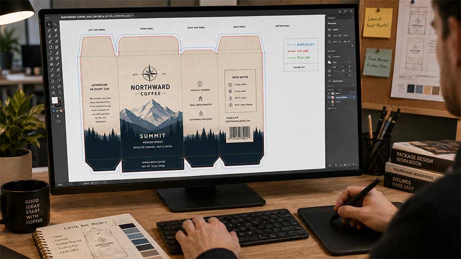
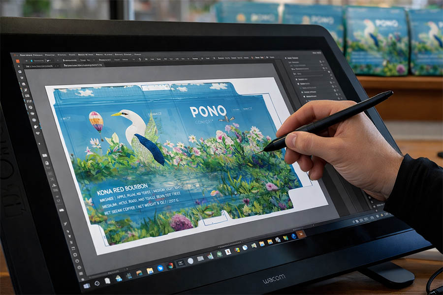
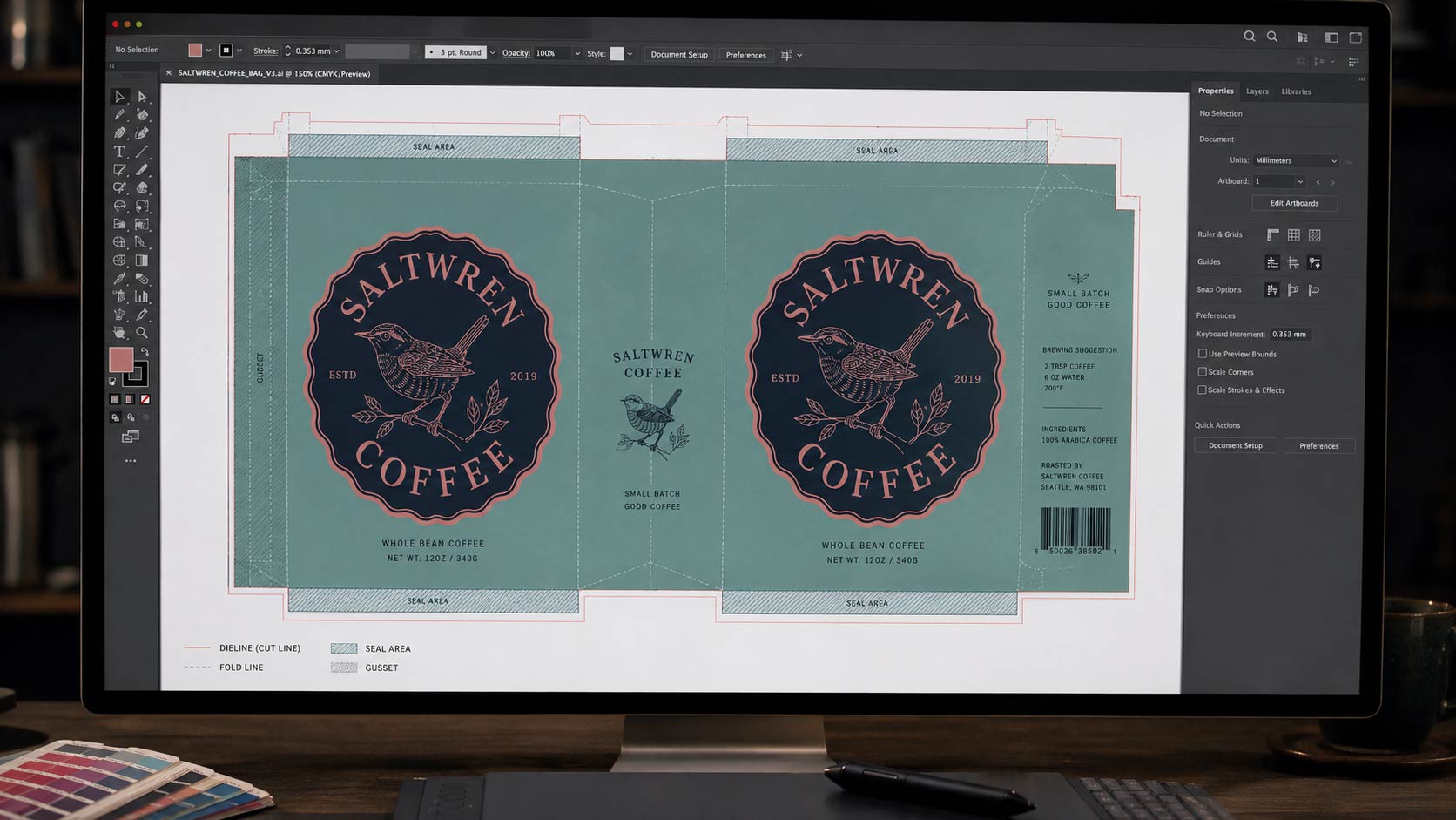
- Dielines present. Your file needs to include the dieline for your specific bag or pouch style, not a generic outline and not a different style's template.
That last one is worth its own paragraph, because it is the single most common reason a file comes back. Every bag style has its own dieline, and our post on
what a packaging dieline is and how to get yours explains why the shape of a stand up pouch and the shape of a quad seal bag are not interchangeable.
What We Flag for a Human Look
This second list is different in an important way. These items do not bounce your file automatically. They get a set of experienced eyes from our design team, because the right answer depends on your specific bag, material, and finish rather than on a rule that can be checked mechanically.
- Minimum font size and trapping, since very fine type behaves differently across substrates
- Matte varnish or spot gloss setup, which needs to be built correctly to land where you intend
- Transparent ink setup, which behaves differently than opaque ink over a printed area
- For roll stock, the eye mark channel, its size and contrast, and the rewind direction
- For bags and pouches, edge bleeds per bag style, and show through on transparent substrates
- Barrier material selection, which we will simply confirm with you if it is not specified
Show through is the one that surprises people most often. On a clear or frosted substrate, whatever is behind the film becomes part of the design, so dark roasted beans sitting behind a light graphic will change how that graphic reads. That is a judgment call, not a pass or fail, which is exactly why a person looks at it.
File Types We Accept
We accept artwork or reference files as PDF, AI, EPS, SVG, or PSD. That range is deliberately wide because we would rather see what you have than have you sit on it waiting to produce a perfect format. A reference file is genuinely useful even when it is not production ready, since it tells our team what you are going for.
The distinction worth keeping in mind is between a reference and a final. A reference communicates intent. A final has to satisfy the six hard requirements above, because it is the thing that goes to press. If you are still at the stage of getting a designer pointed in the right direction, our guide on
briefing a graphic designer the right way covers what to hand them before any of this comes up.
When Something Is Off
If your file does not meet the hard requirements, the most common issue by far is a missing or incorrect dieline. When that happens we follow up with the correct dieline template for your specific bag style so you can update and resubmit quickly. You do not have to figure out which template you need or go hunting for it, because we match it to the bag style you selected on your quote request.
That is the part worth internalizing. A file coming back is not a rejection, it is a round trip, and the cost of it is time. Every round trip is days added before your production clock even starts, and since standard lead time runs 9 to 13 weeks after artwork is completed, those days come straight out of your launch date. Clearing the six hard items before you submit is the cheapest week you will ever save.
What to Have Ready When You Request a Quote
When you request a quote, you will be asked for a few details along with your artwork or reference file. Having them on hand up front is the fastest path from submission to production ready, because every one of these answers changes something about the file we send you back.
- Bag style, since the dieline you receive depends entirely on it
- Estimated quantity, which determines whether digital or rotogravure printing fits
- Size, so the dieline matches your actual fill weight
- Material, since barrier choice affects both shelf life and how your artwork reads on the finished bag
If you are not sure on material yet, our breakdown of
coffee bag barrier materials matches each option to a real shelf life. And if you want to see how the file becomes a physical thing,
mockups and proofs walks through the approval steps that follow preflight.
Where Color Fits In
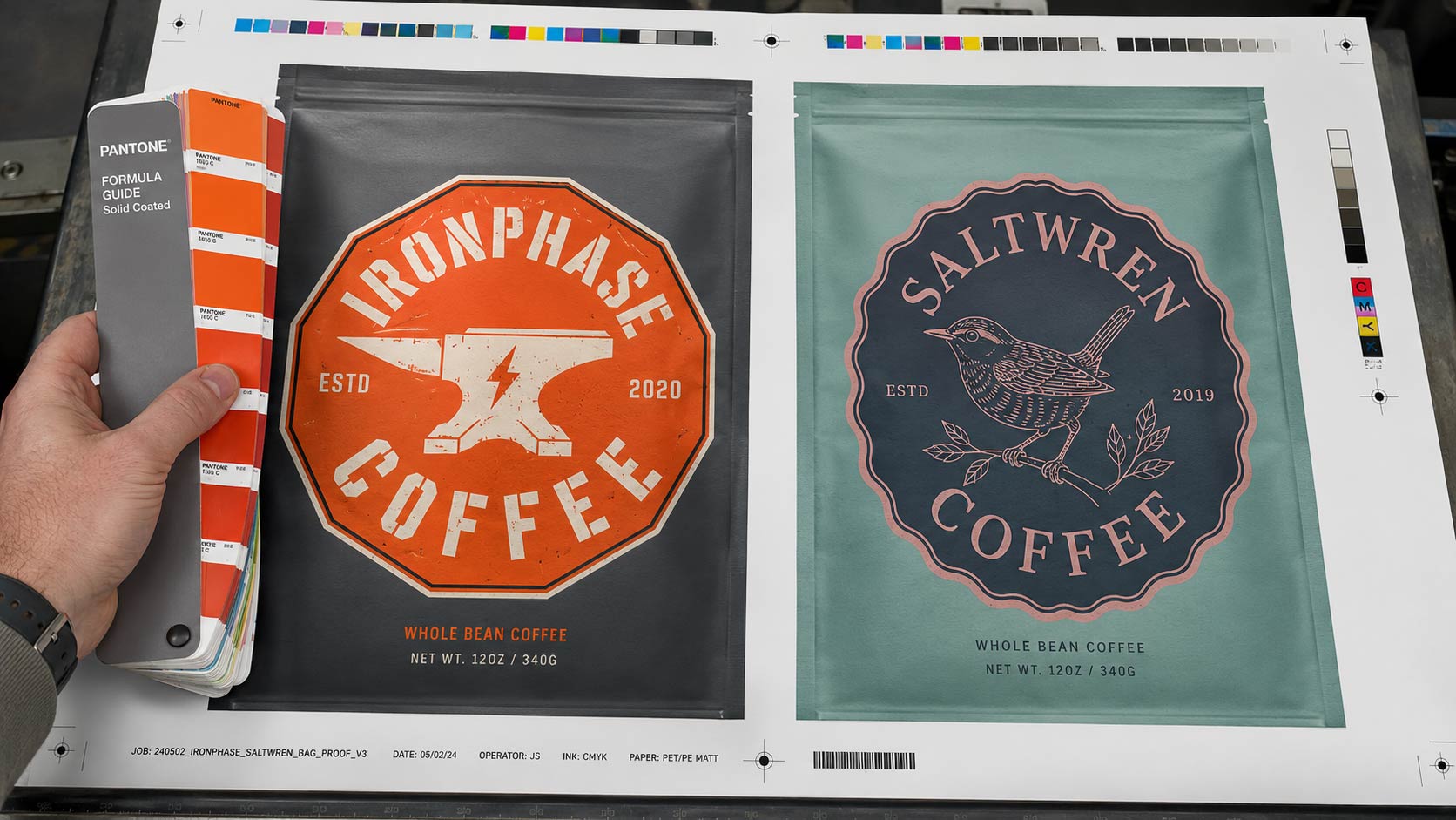
One more thing worth flagging, because it accounts for a lot of surprise at proof time. Images live in CMYK and spot colors live in Pantone Solid Coated, and neither of those is what your monitor is showing you. A screen makes color with light, a press makes it with ink, and the two do not have the same range no matter how good your display is.
This is not a preflight failure, it is an expectations problem, and it is easier to solve before you fall in love with a color than after. Our post on
RGB versus CMYK explains why the same file looks different on screen than it does in your hand, and what to do about it when brand colors matter.
The Cheapest Week You Will Ever Save
None of this is about being strict for its own sake. A preflight check exists so that the bag you imagined is the bag that comes off the press, and every item on the hard list is there because skipping it produces a specific, predictable failure: substituted fonts, missing images, a color that shifts, artwork that lands in the seal area.
So before you submit, run the six. Artwork on the correct layer, text outlined, transparency flattened, images embedded in CMYK at 300 PPI, spot colors as Pantone Solid Coated, and the right dieline in the file. Send it as a PDF, AI, EPS, SVG, or PSD, tell us your bag style, quantity, size, and material, and your
custom coffee bags move straight into production instead of straight back to your inbox.