What Makes a Coffee Line Look Like One Brand
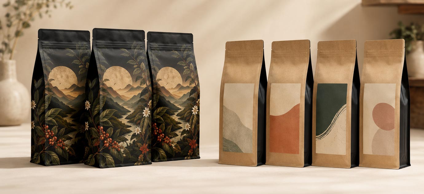
A coffee bag product line holds together when every bag shares one brand system and each roast still gets its own custom-printed design. The system is the constant: your logo, your bag shape, your layout, your type, and one coordinated palette. The design is what you develop for each roast, its own color, its own artwork, its own personality, printed edge to edge. Custom printing is exactly what makes this work, because it lets a light roast and a dark roast look like distinct, considered products while still reading, instantly, as the same company. The roasters whose shelves look effortless did not design one bag and recolor it four times. They built a brand system once, then gave each roast a full custom design inside it.
Lock the Brand System First
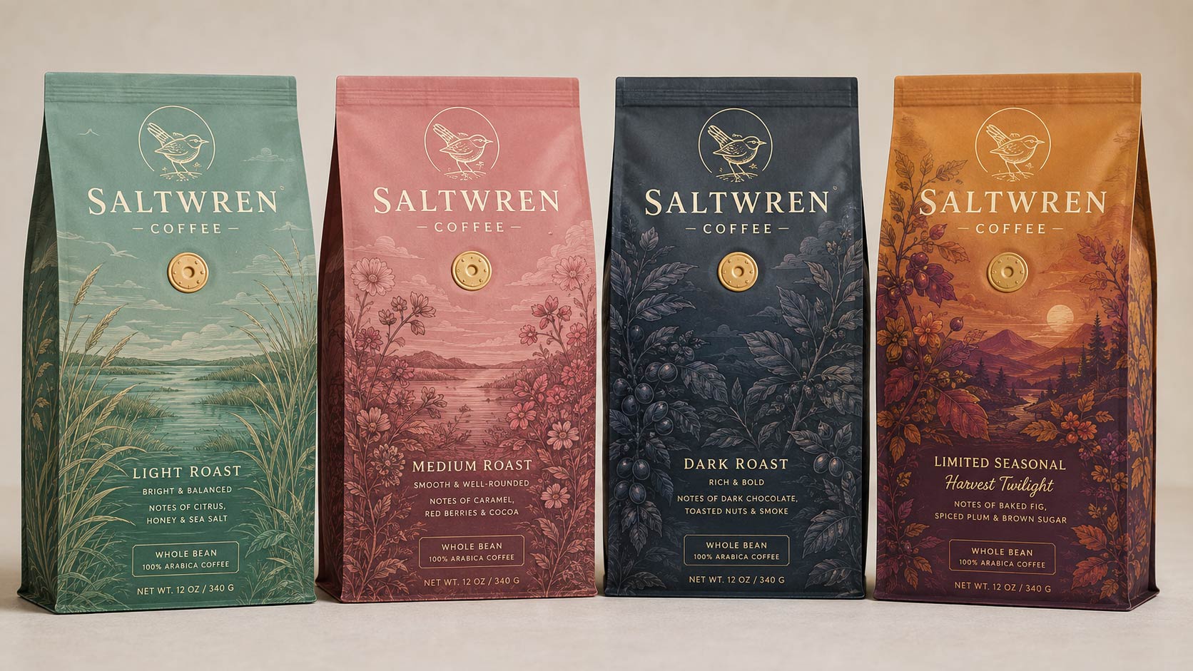
Before you design a single roast, decide what never changes. This shared foundation is what a customer's eye locks onto, so it has to be consistent on every bag in the line. Your logo and wordmark sit in the same place at the same size on every bag. Your bag style stays consistent too, because a
custom coffee bag line reads as a family only when the silhouette matches. A stand up pouch next to a flat bottom pouch next to a side gusset bag will fight each other even in the same colors, so pick one structure for the core line and hold it. Set a layout grid once, where the roast name lives, where the origin and tasting notes go, where the weight and valve land, and reuse that arrangement everywhere. Choose one typeface family and one hierarchy. Keep the finish consistent, whether soft touch matte, gloss, or a foil accent, so the bags feel like siblings. Then choose one coordinated palette for the whole line, so four distinct designs still look related.
Give Every Roast Its Own Design
Now design the part that changes, and this is where custom printing earns its keep. Each roast gets its own full color treatment printed across the whole bag, not a small label added later. You can shift the dominant color, adjust the artwork, and give a single origin a different feel from a house blend, all while the logo, layout, and type hold the line together. Color coding by roast is the most natural system to build on. Many roasters map a lighter, brighter color to the light roast and deepen the palette as the roast gets darker, so the shelf itself reads as a gradient from light to dark. A customer learns your color language in one visit and reaches for the right bag without reading a word. The point of a custom-printed line is that each design can be genuinely beautiful on its own and still belong to the set, which is something a plain bag with a sticker never quite pulls off.
Why Custom Digital Is Built for a Product Line
For most roasters building a lineup,
digital printing is the right engine, and the economics are the reason. Custom digital runs full color, edge to edge artwork starting at just 500 bags per design. That low per-design minimum is what makes a multi-roast line realistic: a three roast lineup is three runs of 500, each fully printed with its own artwork, rather than one compromise design stretched across everything. That floor also gives you room to grow. Adding a fourth roast is another run of 500, not a reinvention, and refreshing the dark roast art next year is a new run of the same size. Because every roast is its own file, you can develop, test, and evolve each design on its own while the shared brand system keeps the shelf coherent. For a growing brand that plans to add origins, blends, and seasonal drops over time, that flexibility at real custom quality is the whole game.
The Budget Entry Point: Stock Bags With Labels
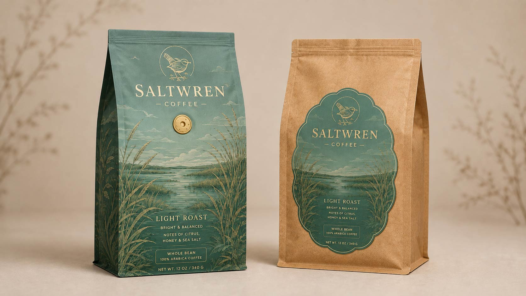
If you are not ready to commit to custom print on every roast yet,
stock bags with applied labels are the entry option. Stock bags come blank in preset sizes starting at 1,000 units, and you finish them with printed labels, so you can put several roasts on the shelf quickly and swap art without a new print run. It is the most flexible way to start and the least expensive to change. Be clear eyed about the tradeoff. A labeled stock bag will never give you the full bleed, printed all over look that makes a custom line feel premium, and it caps how far your design can go. It is a fine place to begin, or to test a rotating experimental roast, but for the core lineup you want customers to remember, custom printing is what sets the brand apart. Plenty of roasters run a hybrid, custom-printed bags for the flagship roasts and labeled stock for the occasional one off, which works as long as the labels follow the same template.
Seasonal and Limited Releases That Stay on Brand
A strong product line has room built in for a seasonal or limited drop, and the key is to treat that release as a member of the family, not a break from it. The seasonal bag uses the same brand system, the same logo placement, the same silhouette, the same layout, and takes a seasonal color with maybe a small added motif in the space your system already reserves for artwork. Printed custom, a fall release in a warm amber sits beside your everyday roasts and reads as a limited edition of the same brand, which is exactly what helps a short run release move. For timing and color moves specific to seasonal work, see our guide to
seasonal coffee bag packaging ideas.
Get the Color Right on Every Bag
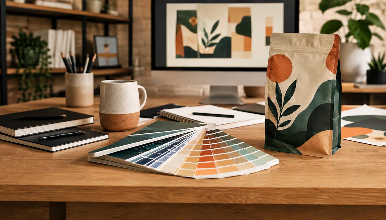
A color system only works if the colors come out the way you designed them, every time you reorder and on the film you actually chose. A color that looks vivid on a monitor can shift once it is printed on a matte surface, so build your palette in print color values from the start and confirm each roast color on a proof before the run. If you want the full explanation of why screen and print color diverge, our breakdown of
why packaging colors look different on screen covers it. Every bag in the line should hit the same colors on the shelf this year and next.
A Quick Blueprint for Your Lineup
Work in this order. Lock the brand system first: logo, bag style, layout grid, typography, finish, and one coordinated palette. Give each roast its own custom-printed design inside that system, with color doing the heavy lifting so the shelf reads light to dark. Use custom digital as your engine, so each roast is its own run of 500 that you can add to and evolve. Keep stock plus labels in your back pocket for testing and one offs, not for the flagship line. Reserve one slot in the system for seasonal releases. Then prove your colors on real film before you print the set. Build the system once, and every future roast simply drops into rules you already made.
Build the Family, Then Design the Members
Fix the brand, and let custom printing make every roast its own. A shared logo, shape, layout, and palette family are what say one brand, and a distinct, fully printed design on each bag is what makes the shelf worth looking at. Do both and your light, medium, dark, and seasonal bags will always look like what they are: one brand, told well, across every roast. When you are ready to build your line, our team can help you spec it on
custom coffee bags.