The Mark You Were Never Meant to Notice
Nearly every choice on a coffee bag is aimed at a person. The logo, the colors, the origin story, the little illustration on the front, all of it is there to catch an eye and tell a story. The eye mark is the exception. It is aimed at a sensor, and the sensor does not care how your bag looks.
Its whole job is to answer one question for the machine: where does one bag end and the next begin? Get that answer right and every bag comes off the line the same height, with your artwork in the same place. Get it wrong and the bags drift, the seals wander, and your logo slides down the front as the run goes on.
What It Actually Is
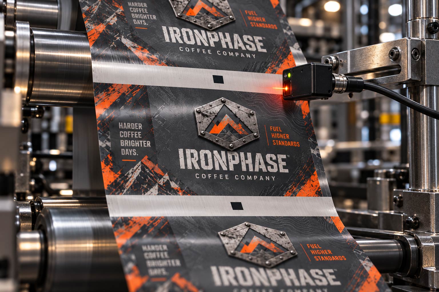
An eye mark is a small, solid block of ink, usually black, printed in a fixed spot on every single bag down the roll. You will also hear it called a registration mark, an eye spot, or a photo-eye mark. It is deliberately plain and high contrast, because it is not meant to be read the way a barcode is read. It is only meant to be seen.
It is printed as part of your artwork, at the same time as everything else, on the same press. The difference is that it lands in the same place on every repeat, like a tick mark running down the edge of a very long ruler.

How the Machine Finds Your Bag
Printed packaging film does not arrive as separate bags. It arrives as one long continuous roll, called a web, with your design repeating down it over and over. Somewhere downstream a machine has to turn that endless printed roll into individual bags, each cut and sealed in exactly the right spot.
It does that with an optical sensor, a little photo-eye mounted over the film. As the web runs past, the sensor watches for the eye mark. Every time the mark passes under it, the machine knows one full bag has gone by, and that is its cue to cut and seal. The eye mark is the metronome the whole line keeps time to.
Why Your Bags Come Out Identical
This is the part that matters to you, even if you never see the mark. Printed film stretches and shifts a little as it travels, and over a long run those tiny amounts add up. If the machine simply cut a fixed length every time, that drift would creep in, and by the end of the roll your artwork would be sliding off position bag to bag.
The eye mark cancels that out. Because the cut and seal are triggered by the mark itself rather than by a guess at length, the machine re-syncs to your actual artwork on every bag. That is why a thousand bags off the same roll all look like the same bag, with the top seal in the same place and the logo sitting where it should. The mark is doing the work that makes your packaging look consistent.
Where It Lives, and Why You Leave It Room
An eye mark needs a clean place to be seen. That means good contrast, a dark mark against a light background or the reverse, and a little clear space around it so the sensor is not confused by artwork crowding in. For that reason it usually sits low on the back panel, off to one side, in a quiet area of the design.
The practical consequence for you is simple: that spot is spoken for. Your artwork should not flood dark ink across the exact place the mark needs to sit, and it should not bury the mark inside a busy pattern. It is small, and it is usually tucked where a shopper will never look, so leaving it alone costs you almost nothing. The back panel is a crowded piece of real estate, though. It also carries the
barcode and its quiet zone and the
seam running down the back, so the smart move is to plan all three together rather than discover them one reprint at a time.
What Goes Wrong Without a Good One
When an eye mark is missing, too faint, or lost inside dark artwork, the sensor cannot find it, and the line falls back to cutting blind. That is when the trouble shows up: bags that come out at slightly different heights, seals that creep up or down the panel, and artwork that drifts until something important gets cut off at the top or bottom.
None of that is a mystery once you know the cause. It is almost always the mark, either because it was never placed, or because the design swallowed it. A mark with clean contrast and a clear margin fixes it, which is why it gets locked in before anything goes to press.
It Is a Roll Stock Idea, Not a Design Flourish
The eye mark belongs to the world of continuous-roll printing and form-fill-seal lines, where film runs off a reel and gets made into bags at speed. That is the same world as
rotogravure roll stock, where a long high-volume run depends on everything staying in register from the first bag to the last.
It is not something you design, and it is not something you should try to style. It is placed by the people making the bag, in the spot the machine needs it. Your job is only to keep your artwork out of its way. On a
digitally printed run you can see exactly where it falls on a proof before anything is committed, which is the easiest time to catch a clash between the mark and your design.
What to Tell Your Designer
You do not need to add an eye mark, and you should not invent one. What you need to do is leave room for it. Tell your designer the lower back panel has a reserved area for a registration mark, keep that area clear of heavy ink and busy pattern, and treat it the same way you treat the barcode's quiet zone: as working space, not wasted space.
If you are not sure where the mark will land on your bag style, ask before the artwork goes out. We can tell you where it sits on a quad seal, a side gusset or a stand-up pouch, and show you the placement on a proof for your
custom coffee bags before anything runs. It is a ten-second conversation that heads off a crooked, drifting print run.
The Mark That Does the Quiet Work
The eye mark is the least glamorous ink on your bag. It is a plain black box, hidden low on the back, that no customer will ever admire. It is also the reason your customer picks up a bag that looks exactly like the one next to it, with the seal straight and the logo where it belongs.
Think of it as the machine's bookmark. It does not decorate the package, it keeps the package honest, bag after bag after bag. Leave it the small clear corner it needs, and it quietly guarantees the consistency that makes your coffee look like a real brand. If you want to be sure your artwork is giving it room,
send us the file and we will show you where the mark lands on your bag before it goes to press.