The One Piece of Art That Has to Work
Everything else on a coffee bag is a choice. The barcode is not. It is the only graphic on the package that has a job to do beyond looking good, and the job is binary: it scans, or the line stops and someone has to key in twelve digits while your customer waits.
That is why the barcode usually gets treated like a tax. It arrives from the designer as a white box dropped into whatever corner had room, and nobody thinks about it again until a retailer sends the product back.
Which is a shame, because the rules that govern it are simpler than people expect, and once you know them there is a lot of room to have fun with it.
What the Scanner Actually Sees
A checkout scanner does not read numbers. It sweeps a beam of red light across the package and measures what comes back. Dark bars absorb the light. Light spaces bounce it back. The scanner reads that pattern of returned and absorbed light, and the widths of those bars and spaces are the code.
Everything that goes wrong with a barcode goes wrong because something interfered with that simple test.
Either the contrast was not there, or the pattern got interrupted, or the surface was not flat enough to sweep cleanly.
Red Bars Are Invisible
Here is the rule that surprises people most, and it is the one that opens the door to the creative work.
The bars have to be dark. Black is ideal. Dark blue and dark green also work. What does not work is red, or anything leaning red like warm brown or burgundy, because the scanner's beam is red light. A red bar reflects red light straight back, so the scanner sees it as empty space. The code looks perfect to your eye and reads as blank to the machine.
Now flip it around. The background behind the bars can be red, for exactly the same reason. The scanner cannot see red, so a red panel reads as white. That means a deep red or burgundy bag is a perfectly good home for a black barcode, which is not what most people assume.
So the real constraint is narrower than "keep it black on white." It is this:
- Bars dark: black, dark blue, dark green
- Background light to the scanner: white, cream, pale anything, and yes, red
- Never red bars, never a dark background behind them
The Quiet Zone Is Part of the Barcode
On either side of the bars there is a margin of empty space. It is called the quiet zone, and it is not padding. It is how the scanner knows where the code starts and stops.
Crowd it and the scan gets unreliable. That means no artwork creeping in from the side, no border box drawn around the code, no leaf or swoosh or bit of pattern tucked into the gap because the layout looked unbalanced.
The quiet zone is part of the symbol, and it has to stay clear.
This is the single most common thing designers get wrong, because an empty margin looks like wasted space on a crowded panel. It is not wasted. It is working.
Do Not Shorten the Bars
When a barcode will not fit, the instinct is to trim it, usually by cutting the height so it takes up less of the panel. That is called truncation, and it quietly breaks something important.
Full height bars let the scanner sweep the code from any angle. That is what makes a checkout fast: the cashier drags the bag past the window in whatever orientation it happens to be in and it reads first time. Shorten the bars and you lose that. The code now only reads when the bag is presented at a particular angle, so the cashier has to turn it, try again, and turn it once more.
It still works, technically. It just works badly, every single time, forever.
If the barcode does not fit, the answer is to move it or to rethink the panel, not to crop it.
Where It Goes on a Bag
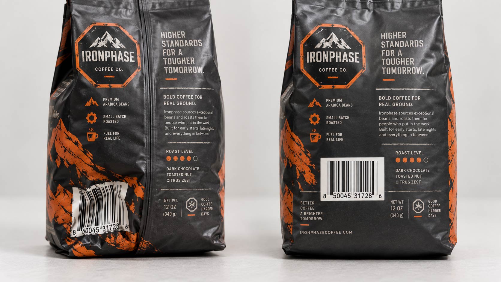
A rigid box is easy. A coffee bag is not, because a coffee bag changes shape when you fill it. The panel that looked flat in the dieline bulges once there is a pound of beans behind it, and a barcode printed across a curve stretches and skews.
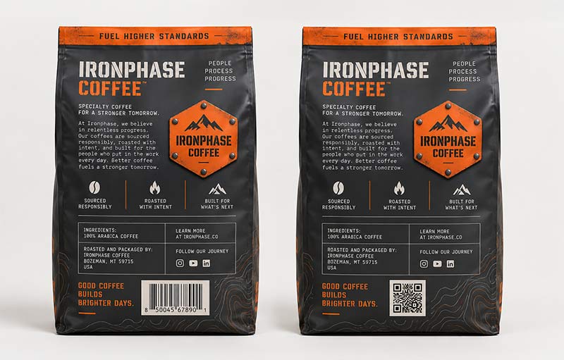
The guidance for flexible packaging is specific. Put the code on the back panel, roughly a third of the way up from the bottom, centred, and as far from the edges as the panel allows. That spot is chosen because it is the part of a filled bag most likely to stay flat. Down near the bottom edge the bag bulges hardest, which is exactly where people tend to put it.
Then there is everything to avoid. The code and its quiet zone must stay clear of seams, folds, edges, ridges, die-cuts and any rough or textured area. Those all interrupt the sweep.
One of those deserves a flag, because it is invisible until you know to look. Every pouch has a
seam running down the back panel, where the flat film was wrapped into a tube and closed. If that seam lands in the middle of your back panel, the barcode goes to one side of it, not across it. A fin seal in particular stands proud of the panel as a small ridge, and a ridge through a barcode is a dead scan.
The same thinking applies if you are putting a shape into the bag outline. A
die-cut edge is a hard no for barcode placement, and so is the sealed border around it.
Now the Fun Part
Read those rules again and notice what they do not say. They say nothing about the barcode having to sit in a white box. They say nothing about it being separate from the artwork. They only govern the bars, the margin, the height and the surface.
Everything around that is yours.
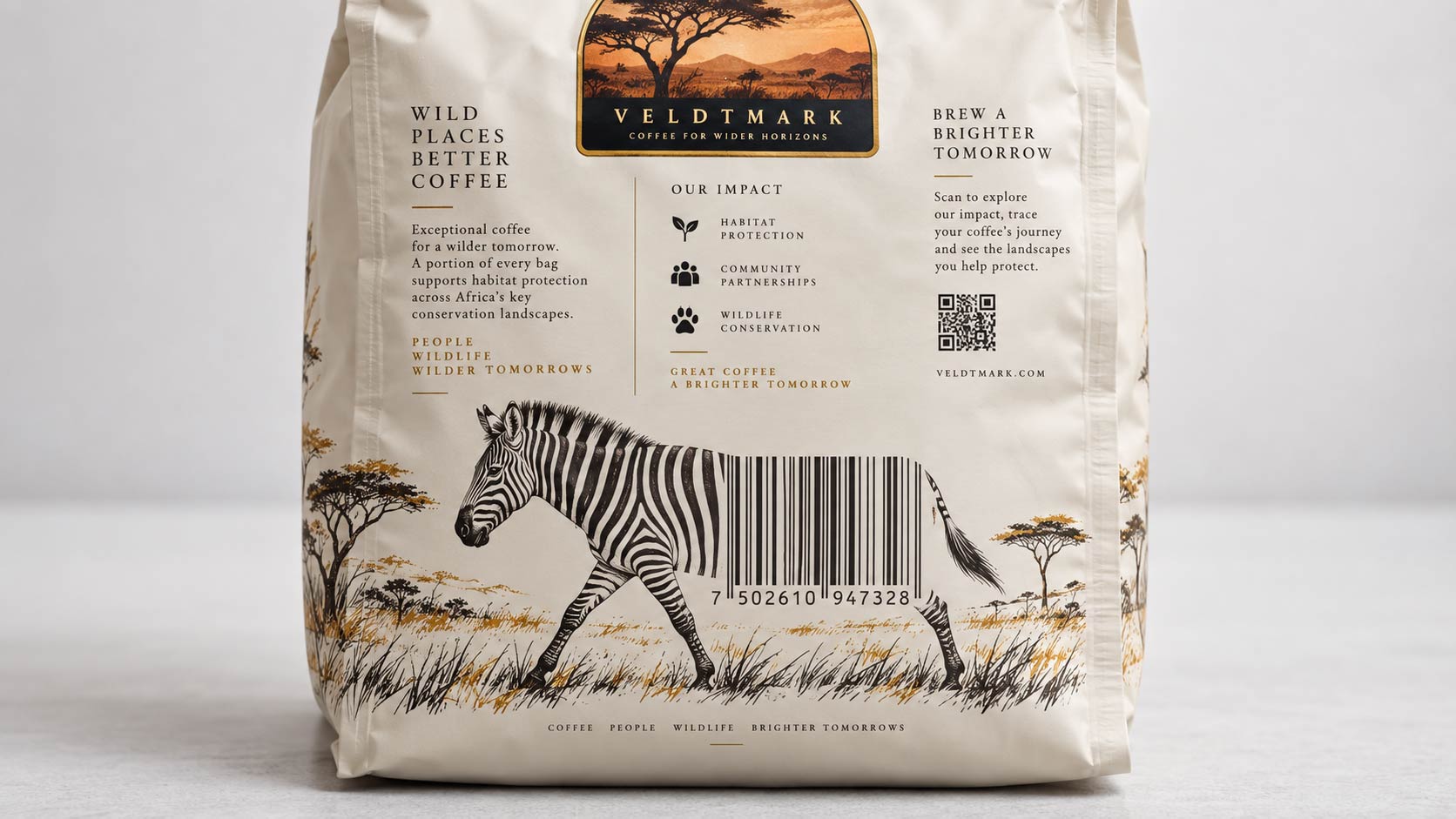
The bars are vertical dark lines of even height on a light field. Think about how many things already look like that. Zebra stripes. The bars of a cell window. A picket fence. Piano keys. A barcode can be the stripes on an animal's flank, the rail of a bridge, the strings of an instrument, the trunks of a pine forest at the edge of a label. The illustration runs into the code and the code finishes the illustration, and the scanner never notices because the bars themselves are untouched.
A few that work on coffee in particular:
- A dark roast with a tongue-in-cheek mugshot: the stripes on the prison T-shirt are the barcode, which also lets you use that deep red background the scanner cannot see
- A safari or single-origin bag where a zebra's flank resolves into the bars
- A diner or roadside theme where the code becomes the slats of a window blind behind the counter
- A night sky where the bars are a city skyline in silhouette
The discipline is the same every time. Draw whatever you like, then protect three things: the bars stay dark and untouched, the margin on both sides stays empty, and nothing gets cropped. You are decorating around the code, not through it.
What to Hand Your Designer
Most of the friction here comes from the barcode being treated as a late addition. It goes on the file last, so it lands wherever there is room, which is usually the worst place for it.
Flip the order. Decide where the barcode lives at the same time you decide where the logo lives, then build the back panel around it. Tell your designer it is going on the back, a third up, centred, clear of the seam, with the margins protected, and that the bars stay full height and dark. Those five facts take ten seconds to say and they prevent the entire problem.
If you are not sure where the seam falls on your style, ask before the artwork goes out. We can tell you where it lands on a quad seal, a side gusset or a stand-up pouch, and on a
digitally printed run it is easy to see the placement on a proof before anything goes to press. Getting it right on the file costs nothing. Getting it wrong costs a reprint, and reprints come back around on the full
custom coffee bag lead time.
Let the Code Earn Its Space
A barcode is a strange thing to design around. It is the only part of the bag that has to satisfy a machine before it satisfies a person, and that makes it feel like an intruder on an otherwise finished layout.
But the machine asks for very little. Dark bars, a clear margin, full height, a flat spot on the back. Everything else on that panel, including the picture the bars are hiding inside, is a free choice. Treat it as a design element with four rules instead of a sticker you have to hide, and it stops being the ugly box in the corner and starts being the joke nobody expected to find on the back of the bag.
If you are laying out a back panel and you are not sure where the seam falls or whether your code has room to breathe,
send us the artwork and we will tell you where the barcode can sit on your bag style before anything goes to press.