What Is Packaging Glare?
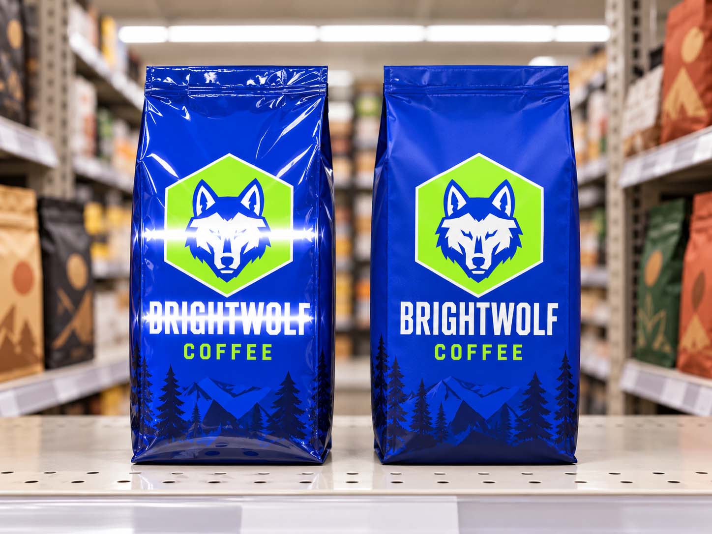
Packaging glare is the bright, washed-out patch you see when light reflects straight off a glossy bag and into your eyes. On a coffee shelf it usually shows up as a white stripe running across the front of the bag, and wherever that stripe lands, the printing underneath seems to fade. Nothing is wrong with the ink. The light bouncing off the surface is simply brighter than the colors beneath it.
Most roasters first notice it in a photo. A retailer sends a shelf picture, or a customer posts one, and the brand name looks pale or half gone. The natural reaction is to blame the printing. Pull that same bag off the shelf, look at it on your desk, and the color is fine.
That is the giveaway. A color problem travels with the bag. Glare stays with the light.
Why Does a Filled Coffee Bag Catch the Light Like That?
Because the front of a filled bag is curved, and a curve always has one band that is angled straight back at the lights.
A glossy surface behaves a little like a mirror. Light bounces off it at the same angle it arrives, so on a perfectly flat panel you only see the reflection from one exact spot. Move your head a few inches and it slides off the edge.
A filled bag is not flat. The coffee pushes the front panel outward into a gentle bulge, so the surface faces a slightly different direction at every height. Somewhere on that curve there is a band tilted at exactly the right angle to send the ceiling lights straight to a shopper's eyes. That band is the stripe. And because the bag is curved, you cannot step out of it the way you can with a flat sign. Move, and the stripe just slides to a new spot on the bag.
Two things make it stronger:
- Long overhead strip lights, the kind most grocery aisles use, stretch the reflection into a horizontal bar instead of a small dot.
- A fuller bag bulges more, which spreads the reflection across a taller band.
Why Does Glare Land on the Brand Name So Often?
Because most designs put the brand name in the middle of the front panel, which is where the bag bulges most and where a shopper looks first. That is a design habit, not a rule, but it puts the most important word right where the stripe likes to sit.
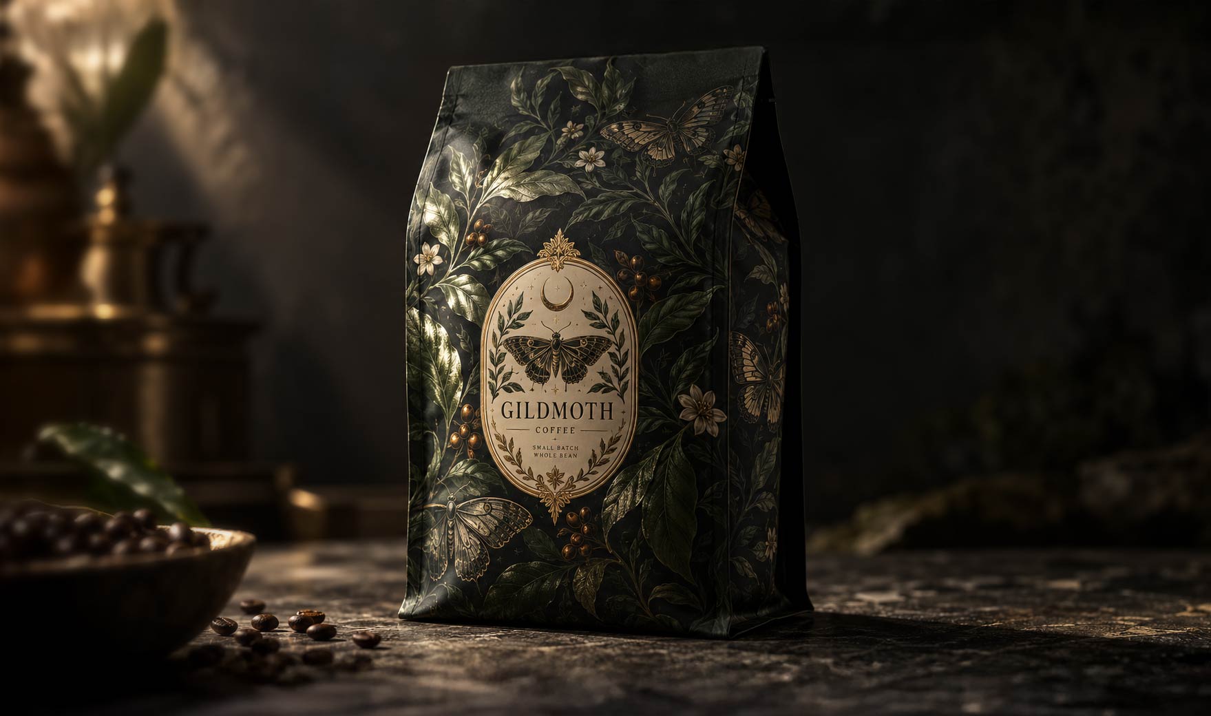
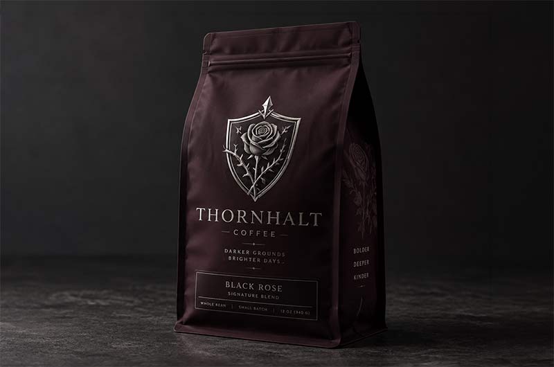
Glare also does the most damage to the colors designers love most. The reflection adds white light on top of whatever is printed, so every color drifts toward pale. A light color barely changes. A deep black, navy or forest green can drop to a gray smear, and thin type inside the stripe can vanish completely. A dark glossy bag with a fine-line logo is the worst case there is.
Are Metallic and Clear Bags Worse?
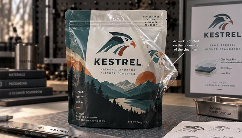
They can be. Metallized film and foil are reflective on purpose, which is exactly why they catch the eye from down the aisle. The same quality gives them a harder, brighter highlight under direct light. Clear film over a window behaves a lot like glass and reflects much the way gloss does.
None of that is a reason to avoid them. Metallic accents sell. It is a reason to keep the words people need to read off the most reflective areas, or to give those words a matte surface.
On most coffee bags the ink sits on the inside of the outer film, which we explain in
why your bag is printed on the inside. So the shine you see is the film itself, and the film's surface is what a finish changes.
How Do I Reduce Glare on My Coffee Bags?
You have four tools, and you can combine them.
Go matte. A matte finish scatters light instead of mirroring it, so there is no bright stripe. The trade is that matte softens color a little, because the same scattering that kills the glare also takes some punch out of bright tones. For plenty of brands that calm, even look is the whole point. Soft touch is the velvety, premium version of matte, and it comes with its own trade, covered in
our soft touch post.
Use matte where the words are and gloss where the art is. You do not have to pick one finish for the whole bag. On rotogravure jobs, matte varnish can be applied to selected areas, so the name and key copy stay readable while the graphics keep their shine. How that works, and why it is really a matter of taking gloss away, is in
your coffee bag is already glossy.
Make the name tough enough to survive the stripe. A bold, heavy, high-contrast name stays readable even with a band of glare across it. A thin script or a dark-on-dark logo does not. If you love gloss, design a name that can take a hit.
Move the name out of the stripe. Once you know where the reflection lands on your bag, you can set the name above or below it. The test in the next section shows you exactly where that is.
Fill level matters as well. A bag stuffed to the top bulges more and catches a wider band of light. Filling to the weight the bag was sized for keeps the front panel flatter, which is one more reason to size your bags around your real fill.
How Do I Test My Bag for Glare Before I Order?
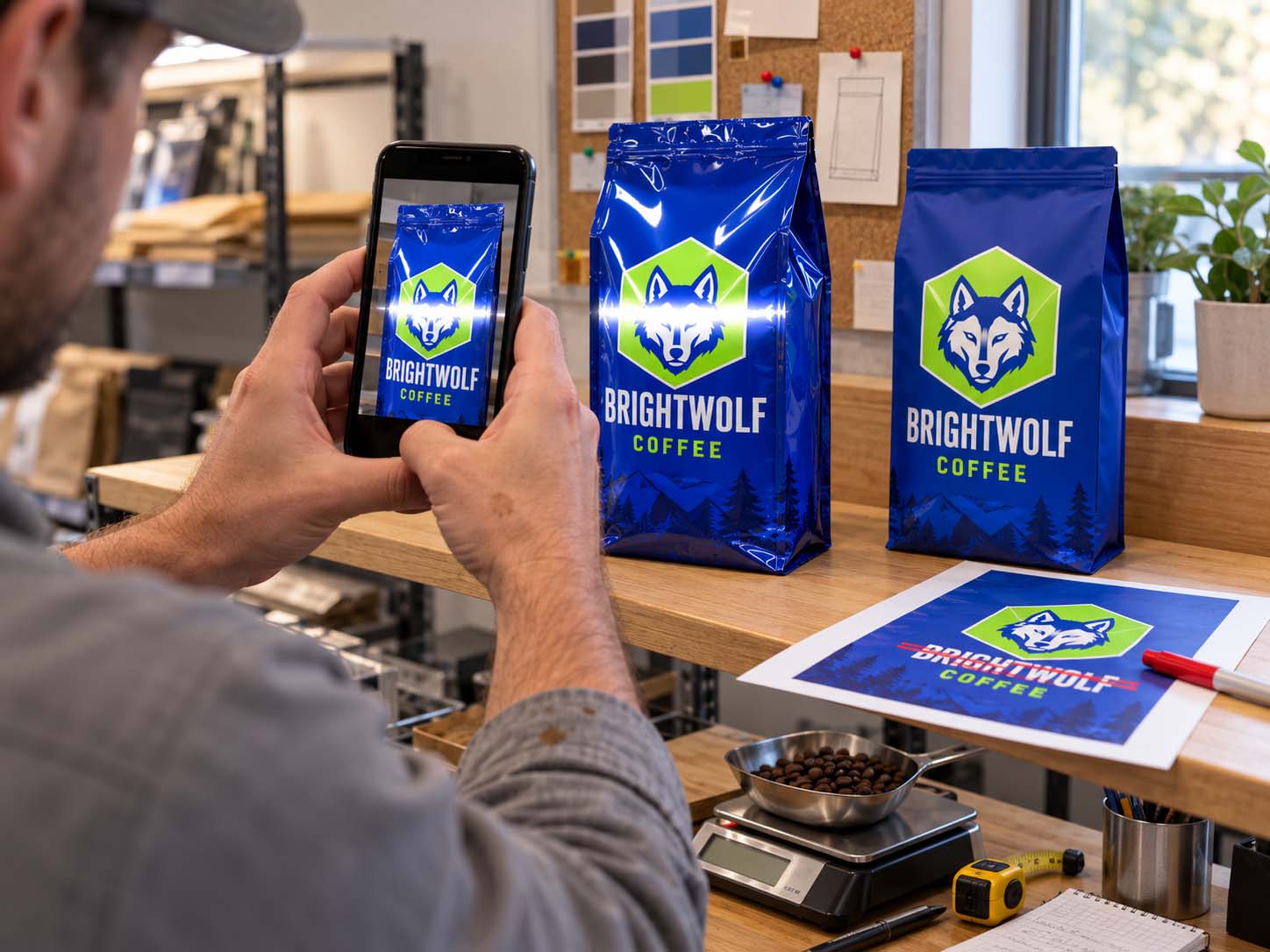
Fill a sample bag with your real coffee at your real weight and look at it under ordinary overhead lights, the kind you find in an office, a kitchen or a shop. Then:
- Stand it on a shelf at about eye height, step back to where a shopper would stand, and look for the stripe.
- Crouch down for the bottom shelf view, then reach up for the top shelf. Watch the stripe move.
- Take phone photos from each spot. Cameras exaggerate glare, which helps, because that is the picture customers will post.
- Mark on a printout of your artwork where the stripe crossed the bag. If it runs through the brand name, you have your answer.
Do this with every finish you are weighing. Five minutes with a filled sample answers what no screen mockup can, because a screen has no ceiling lights.
Is Glare the Same as a Color Shift Under Store Lights?
No. Glare is about how much light bounces off the surface. The color of the light itself is a separate effect, and it can make two inks that matched on your desk look different in the store. We cover that one in
your bag matched the proof on your desk.
Telling them apart is simple. A bright patch that moves when you move is glare. A color that looks wrong from everywhere in the aisle is the light.
How Savor Brands Helps You Pick a Finish
We print
custom coffee bags in gloss, matte and soft touch, and on
rotogravure runs we can put matte and gloss areas on the same bag. For smaller runs,
digital printing starts at 500 bags per design, which makes it practical to try a finish on a real product before you commit to volume.
Before you approve a finish, tell us where your bags will be sold and what kind of lighting they will sit under. Then ask for samples in the finishes you are considering and run the five minute test on your own shelf.
The Light Is Part of the Design
A coffee bag is designed on a screen and sold under ceiling lights. Gloss gives color its punch, and on a curved, filled bag it also guarantees a bright stripe somewhere on the front. The answer is not to fear gloss. It is to decide where that stripe is allowed to land: matte where the words are, a name strong enough to survive it, and a quick test with a filled sample before you order.
If you want a second opinion on your design and your shelf,
send us your artwork and tell us where the bag will live.