The Shine Was Already There
Pick up a coffee bag with a glossy finish and your instinct is that someone added the gloss. Something shiny went on top. That is how most finishes are described, and it is how most designers brief them.
On a rotogravure bag with a PET outer layer, it works the other way around. The film arrives glossy. That is just what PET is. The shine is the starting condition, not the thing you add.
So when a bag in front of you is matte, something was applied to make it matte. And when part of that same bag gleams while the rest stays flat, nothing was added to the gleaming part. Something was withheld from it.
Matte Varnish Is a Subtraction
Matte varnish is a coating that knocks down the natural gloss of the film underneath. Lay it over the whole face of a bag and the whole bag goes flat.
The artwork does not change and the colours do not change. Only the surface changes, and it stops reflecting.
That is the normal case, and it is why so many coffee bags look like soft chalk. Somebody chose a full matte varnish and got an even, completely flat face.
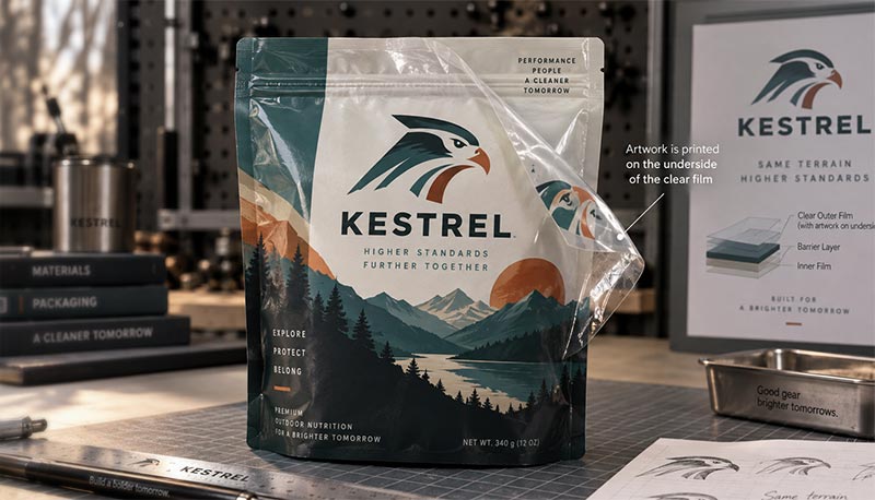
There is a detail here that makes the whole thing make sense. Your artwork is not sitting on the outside of the bag where the varnish lands. On these bags the ink is
printed on the inside face of the outer film, sealed into the wall of the bag. So the varnish is not touching your design at all. It is treating the clear film that sits over the top of it.
That is why this changes the finish without touching the colour. You are adjusting a window, not painting the picture behind it.
The interesting part is what happens when you do not apply that coating evenly.
You Can Dial the Percentage
Rotogravure does not force an all-or-nothing choice. The varnish can be applied at a reduced percentage over selected areas, which means you are not choosing between matte and gloss. You are choosing how much of the film's own shine to let through.
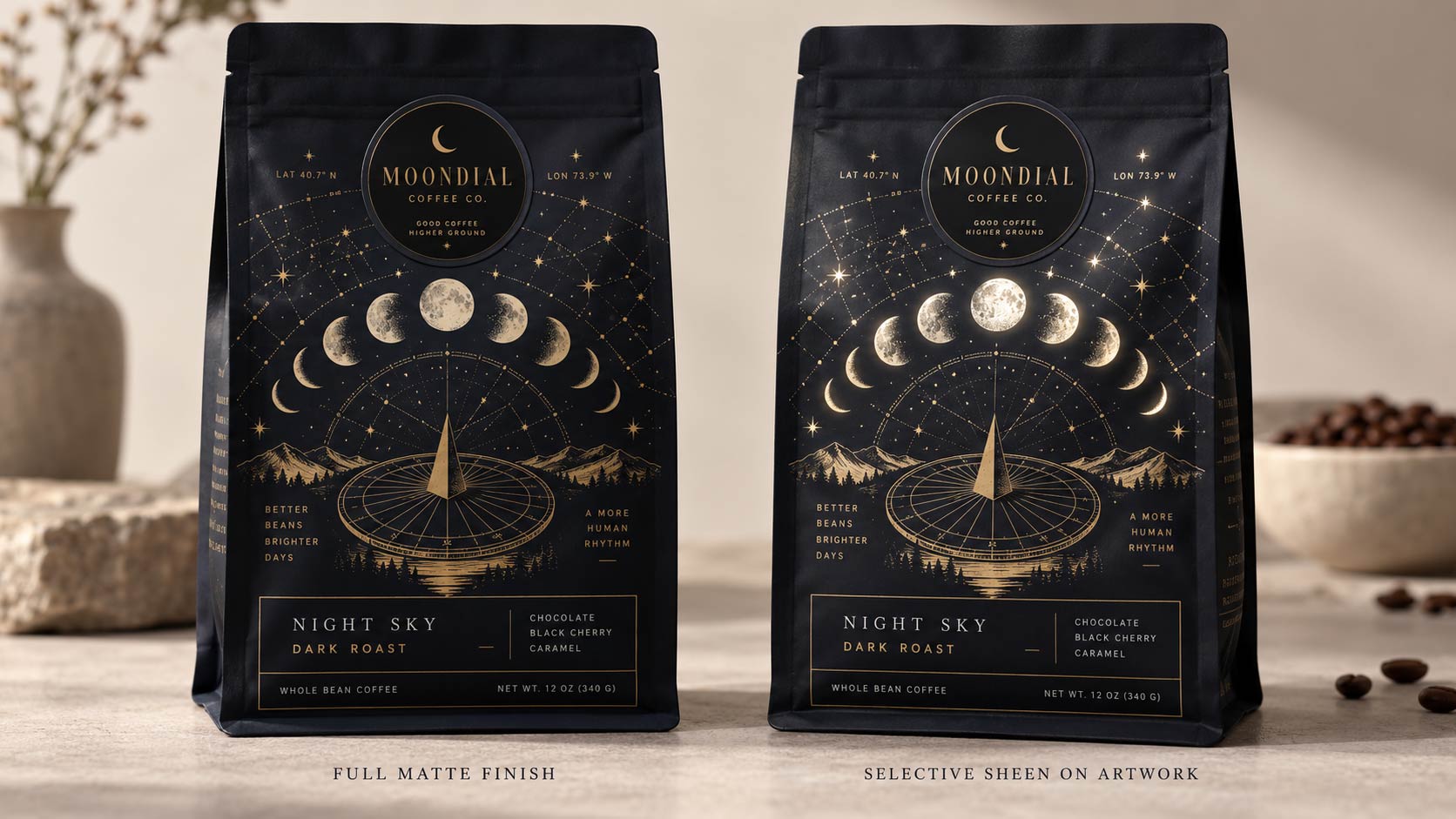
Put the full varnish treatment over most of the bag and about half the varnish over the areas you want to stand out, and those areas keep more of the PET's natural gloss. They are not as glossy as bare film. They are not as flat as the fully varnished areas. They sit in between.
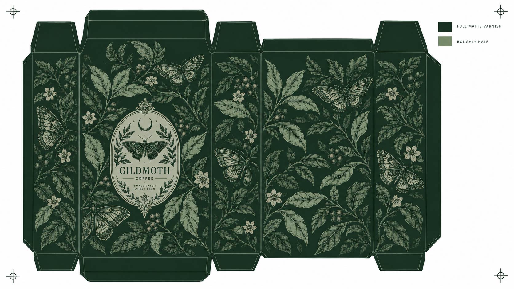
That in-between is the whole point. When the light hits the bag you can clearly see the difference between the two areas, but the selected areas still look softer than raw glossy film would. It reads as a sheen rather than a flash.
Why That Half Step Matters
A hard gloss against a dead matte is a loud effect. It shouts, and on a premium bag it can tip into looking cheap, like a sticker got left on.
A reduced percentage gives you contrast without the shout. The pattern surfaces as the bag turns under a shelf light and then settles back down.
A customer picking it up will see it move. They almost never work out why, which is exactly the behaviour you want from a finish.
It also means the effect is tunable. More varnish in the selected areas gives a subtler difference. Less gives a stronger one. It is a dial, not a switch.
One thing to keep in mind while you are choosing: this effect is made of reflections, so it depends entirely on the light the bag is standing in. A sheen that reads beautifully under the warm spots in a café can go nearly invisible under flat overhead strips in a grocery aisle. Finishes and
store lighting are tied together, and it is worth knowing where your bag will actually sit before you decide how strong to make the contrast.
It Lives in the Negative Space
Here is where this flips how you brief it.
If you think of the effect as adding shine, you will mark up the artwork saying "gloss here, gloss here, gloss on the logo." On a rotogravure bag that instruction is backwards. The press is not adding anything to those spots. It is applying less to them.
What the printer actually needs is a varnish map: a version of your artwork that shows which areas get the full matte treatment and which get the reduced percentage. The shine lives in the gaps. You are designing the negative space, and the gleam is what is left over where the coating was pulled back.
That is a different mental model from the one most designers carry, and it changes what you hand over. Not "make this shiny" but "put less varnish here."
What This Is Not
There is another way to get gloss contrast, and it is worth keeping the two apart because they pull in opposite directions.
Spot UV is a clear gloss varnish laid onto selected areas over a matte or uncoated base. That one genuinely is additive: a shiny layer goes on top of specific spots, and the contrast comes from what you put down. We cover it alongside foil and embossing in our guide to
coffee bag finishes, where it earns its place as a way to elevate a bag without paying for foil.
The rotogravure matte varnish route arrives at a related effect from the opposite end. Nothing shiny is applied. The gloss was in the film the whole time and the coating decides how much of it you see.
Knowing which one you are asking for keeps the conversation with your printer short.
What to Send Us
If you want this on a bag, the useful thing to supply is not a note. It is a file.
Send your artwork with a separate layer or a clearly marked version showing the varnish treatment, in two values: the areas getting the full matte varnish and the areas getting the reduced percentage. Two flat tones are enough. It does not need to be pretty, it needs to be unambiguous about which area is which.
Then say the percentage out loud, as a request, in writing.
This is the part people assume the file handles for them, and it does not. The artwork shows where the reduced varnish goes. It cannot carry how much. The percentage is a value that gets set for the run, so it has to be asked for and agreed rather than inferred from how light the tone looks on your screen. Mark the areas, then tell us the level of contrast you are after and we will set it.
A few things worth deciding before you send it:
- Which elements actually benefit from catching the light, usually a logo, a pattern, or a single word, not everything at once
- Whether you want the difference obvious across a room or only visible when the bag is picked up, because that is what the percentage decides
- Whether the surrounding area should be fully matte, which gives the strongest contrast
This is a
rotogravure technique, so it belongs to runs printed from engraved cylinders rather than to every print method we offer. If you are not sure which process your job is on, ask before you build the varnish layer.
It is also worth raising early rather than late. The finish is part of how the job is set up, not something applied afterwards, so the time to talk about it is while the
custom coffee bag is still being specified, alongside the structure and the size.
Design the Gaps, Not the Gleam
Most finish decisions are about what to put on a bag. This one is about what to leave off.
The film under your artwork is already doing something. It is glossy, it reflects, and left alone it would shine. Everything you do to the surface after that is a decision about how much of that to hide. Full varnish hides all of it. Half varnish hides some. Where you pull back is where the bag catches the light.
Once you see it that way, the finish stops being a thing you bolt on at the end and becomes part of the drawing itself.
If you want this on a bag and you are not sure how strong to make the contrast,
send us the artwork with the areas marked and tell us what you are going for, and we will set the percentage with you before the job is laid out.