Why a Bag That Looks Great on Your Desk Disappears in the Store
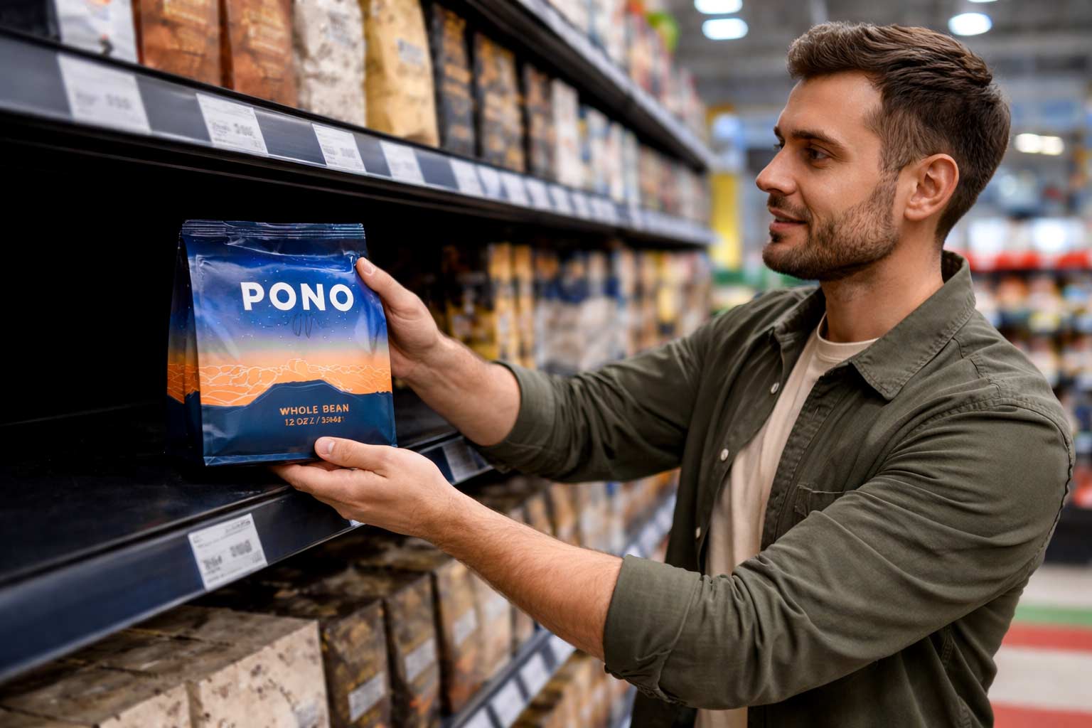
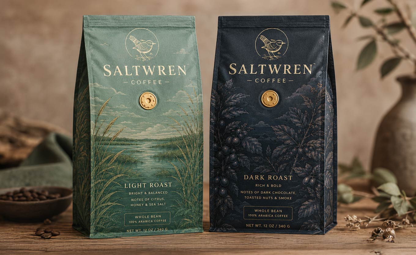
On your desk, your new bag is the only thing in view. Your designer showed it to you full screen, on a clean background, maybe next to a cup of coffee, and every choice looked deliberate. Then the bag lands on a grocery shelf beside a long row of other coffee, and the shopper sees all of it at once, from a few steps away, in a few seconds.
That moment decides whether anyone picks your bag up, and it is the one moment almost nobody designs for. Most packaging gets judged alone. It gets sold in a crowd.
The fix is simple and costs nothing. Before a designer opens a file, go stand in the aisle where your bag is going to live.
The Real Mistake: Designing Without Seeing the Shelf
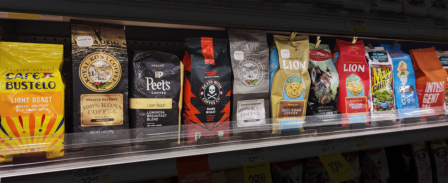
Coffee aisles tend to drift toward one look. When a style works for a few brands, others follow it, and before long a whole section shares the same kraft paper, the same earthy palette, the same small centered logo and the same line drawing of a mountain or a coffee plant. Each bag is attractive on its own. Together they blend into one brown wall.
A brand that designs without seeing that wall usually adds one more brick to it. Nobody sets out to copy anyone. It happens because the same references, the same mood boards and the same idea of what good coffee is supposed to look like lead everyone to the same place. The bag that wins the aisle is often not the prettiest one. It is the one that looks different from its neighbors.
How to Run a Shelf Audit in One Afternoon
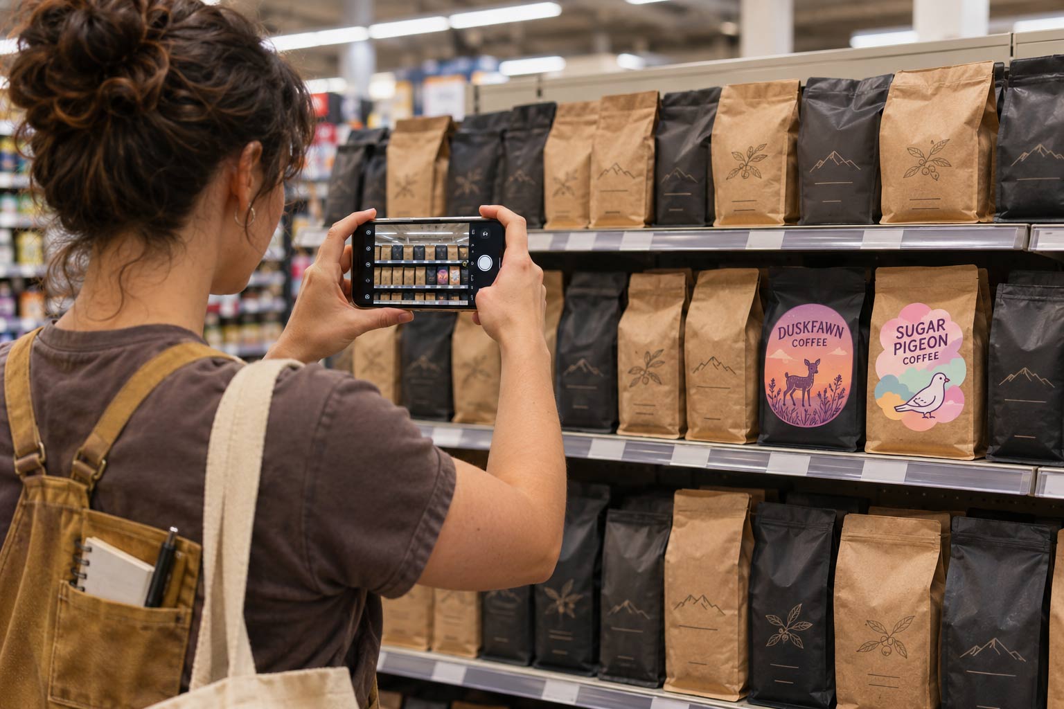
A shelf audit is a planned visit to the stores where you want to sell. You do not need special tools. A phone and an hour or so per store is enough, and the photos will guide every design decision that follows.
- Visit the real stores. Go to the specific grocers, markets and cafés you plan to pitch, not just the biggest store in town. The shelf you are trying to win is the one that matters.
- Photograph the whole coffee set. Step back far enough to fit the full section in one frame, then take closer shots of the shelf where your bag would most likely sit.
- Shoot from where shoppers stand. Take one photo from normal walking distance and another from the end of the aisle. Most buying decisions start at a distance.
- Write down the neighbors. Note the brands, colors, bag shapes and price points directly above, below and beside the spot your bag would take.
- Notice the lighting. Bright overhead tubes, warm spotlights and window light all change how color and gloss look.
Back at the office, put the photos on one screen and look at them as a set, not one at a time.
What to Look For in Your Shelf Photos
You are looking for the pattern everyone else follows, because that pattern is exactly what your bag needs to break. Ask a few blunt questions.
- What is the most common color? If most bags are kraft brown, black or white, that color has become background noise, and a bag in it has to work much harder to be seen.
- What shape fills the shelf? If it is mostly stand-up pouches, a box bottom bag stands taller and reads as a solid block. If it is mostly box bottoms, the reverse can be true.
- Where do the names sit? If every brand centers a small logo near the top, a name that runs large across the front gets noticed.
- Which bag did your eye go to first? Show the photo to someone who has never seen your brand and ask them to point. Whatever they pointed at did something right. Work out what it was.
- Which bags vanished? Note the ones you could not find even while looking for them. Those are the designs not to copy.
Design to Break the Pattern
Once you know what the shelf looks like, the brief for your designer gets much sharper. Instead of asking for something that looks premium, you can say that the shelf is all kraft and earth tones, so the bag needs a strong color nobody else uses, and the name has to be readable from the end of the aisle. That is a brief a designer can actually work with.
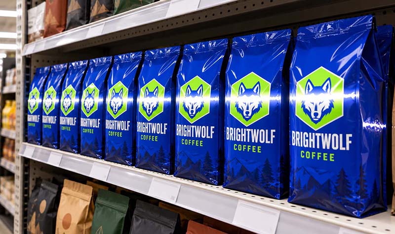
Breaking the pattern does not mean shouting. On a loud shelf full of bright color, a calm bag in one deep, solid color can be the one that stands out. The goal is contrast with the neighbors, not volume. Our guide to
coffee bag color and finish on the shelf covers how individual colors and finishes behave once you know which direction you need to go.
Then make sure the design still works once it is printed and lit. A glossy front can throw a white stripe of reflected store light across the name, which our post on
packaging glare explains, and two colors that match on your monitor can drift apart under store lighting, covered in our post on
color under store lights. Bring your shelf photos to both of those decisions.
Brand Blocking: Make Several Bags Work Like One Sign
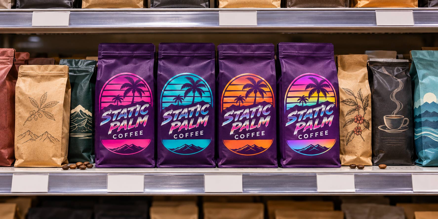
If you sell more than one roast, the shelf audit gives you a second job. A group of matching bags is far easier to spot than a single bag. When every roast in your line shares the same layout, logo position and type, and only one color or accent changes from roast to roast, the bags line up into one block of color that works like a sign. Merchandisers call this brand blocking.
The opposite happens when each roast gets its own style. On the shelf they look like products from different companies, and your line gives up its biggest advantage, which is that there is more than one of you. Lock the shared system first, then change only the parts that tell the roasts apart. Our post on
designing a coffee bag product line goes into how to set that system up.
How Savor Brands Helps You Get It Right Before You Print
A bag that disappears on the shelf is an expensive lesson, because by the time you see it in the store the run is already printed. We would much rather you catch it at the proof stage.
- Start from your shelf photos. Share them with your brief, so the conversation about color, shape and finish begins with the shelf you are actually trying to win.
- A proof on the real dieline. Every custom bag gets a digital proof laid out on the exact dieline, so you can see where the name lands on the front panel before anything is printed. Our post on mockups and proofs covers what to check.
- A real bag beside the real shelf. Ask us about samples. A physical bag you can hold next to your shelf photos, or take into the store, tells you more than any screen. See our guide to ordering packaging samples first.
- Test before you commit. Custom digital printing starts at 500 bags per design, so you can try a new look in a few stores before you order a large run.
- Shape as a deliberate choice. If your audit shows the whole shelf is one bag style, we can help you weigh the custom coffee bag styles that would stand apart from it.
Win the Aisle Before You Win the Buyer
Your bag will be seen in a crowd long before anyone sees it up close, so design it for the crowd. Walk the aisle, photograph the shelf, find the color and layout every brand shares, and give your designer a brief that breaks it. If you sell several roasts, make them line up into one block that works like a sign. Then proof it, hold a sample against the shelf and test it in a few stores before you order big.
Getting a buyer to say yes is its own job, which our
retail buyer guide covers. Winning the shopper who walks past that shelf every day starts with an afternoon in the aisle. When you are ready to design,
talk to us about your bag and bring the photos.