Shoppers Read the Shape Before They Read the Name
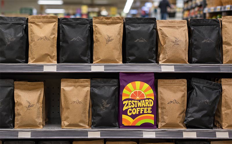
A shopper scanning a shelf takes in shape and color first and words last. Before anyone reads your name, your roast or your tasting notes, the silhouette of the bag has already told them what kind of product this is, roughly what it costs and who it is for. That first read happens in a second or two, and it is hard to undo.
That makes your coffee bag style a branding decision, not just a packaging spec. Most brands pick a style for fill weight, price or habit, then ask a designer to make it look premium or friendly or fun. When the shape and the artwork say the same thing, the bag feels right. When they disagree, the shopper senses something is off, even if they could never say what.
What Each Coffee Bag Style Says
Every common style carries its own first impression. None of them is better than the others. They just say different things.
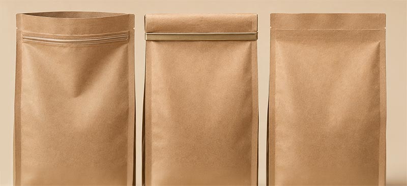
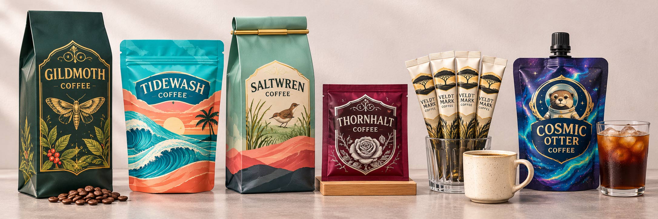
- Box bottom (quad seal flat bottom). It stands tall and square like a small box, with crisp corners and a flat front panel. It reads as premium, solid and carefully made, and it gives you the most usable front for branding.
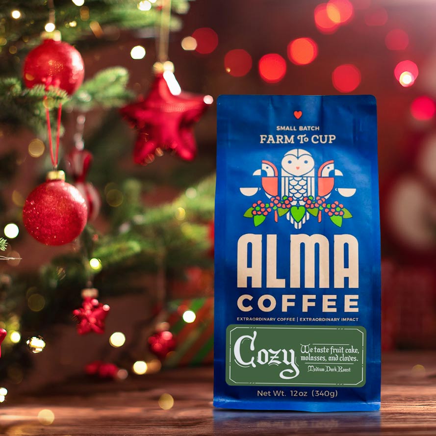
- Stand-up pouch. Rounded at the base and softer in outline, it reads as approachable and everyday. It is the familiar grocery-aisle shape, friendly rather than formal.
- Side gusset. The traditional coffee bag, folded at the sides and often closed with a tin tie. It reads as classic and roaster-direct, and in large sizes it reads as wholesale or café supply.
- Quad seal V cut. Four reinforced corner seams with a wedge base instead of a square bottom. It reads as a workhorse bag, the shape you see on bulk fills behind a counter. Our post on the quad seal V cut covers it in detail.
- Flat pouch. Small and slim with no gusset, it reads as a sample, a gift or a single serving. Shoppers expect to try it, not stock up on it.
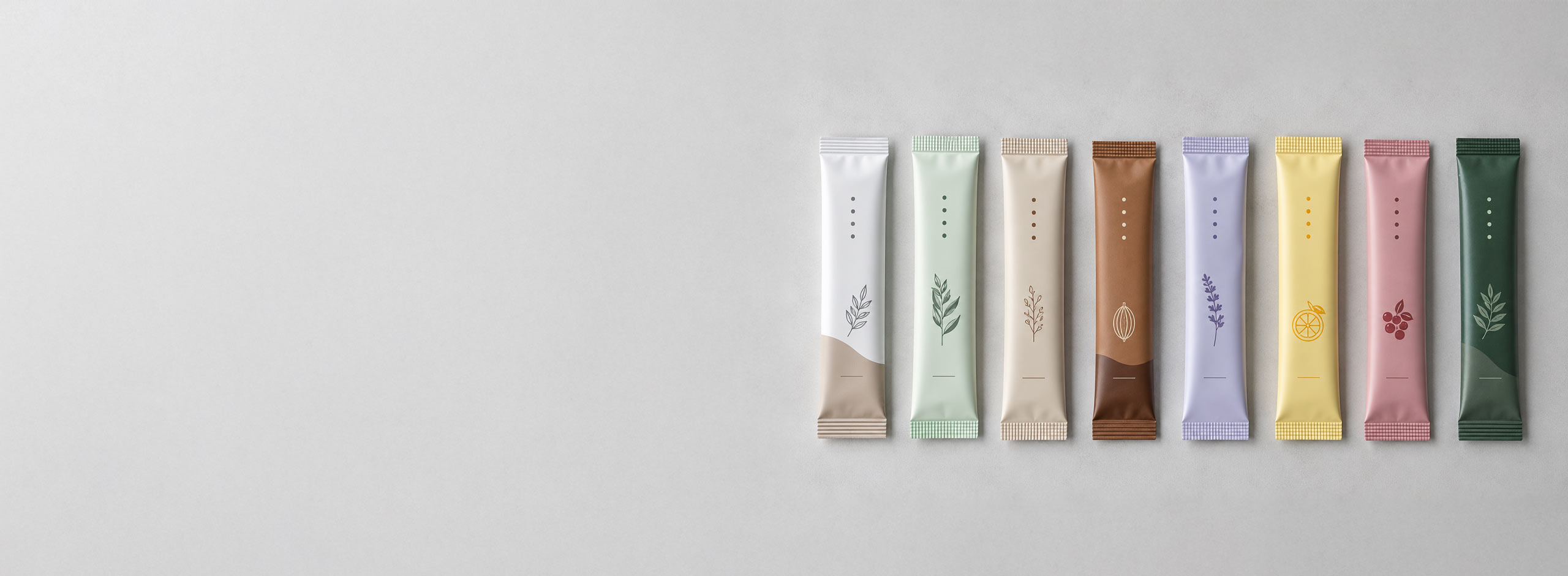
- Stick pack. The long, thin single-serve format people know from instant coffee and drink mixes. It reads as grab and go, one cup at a time, perfect for travel, trial and convenience. See our guide to stick pack packaging.
- Spouted pouch. A pouch with a molded spout and cap reads instantly as a liquid. On a shelf it says cold brew, concentrate or something you pour, and it looks modern next to cans and bottles.
The Real Mistake: When the Shape and the Artwork Disagree
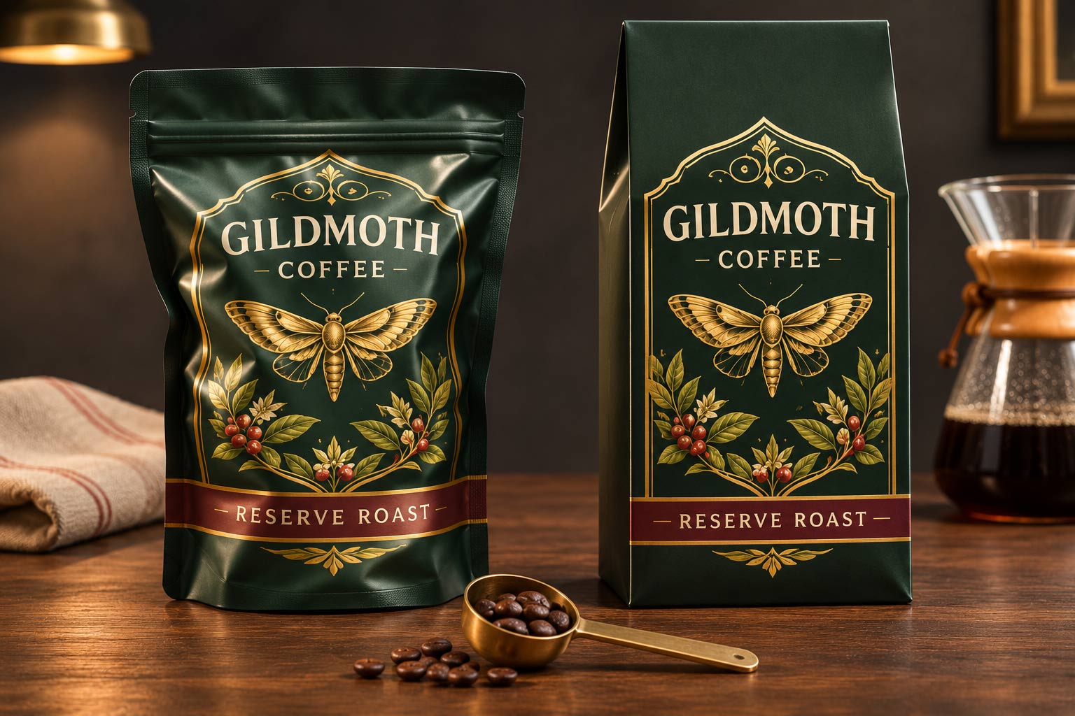
The problem is rarely a bad shape. It is a shape that sends one message while the artwork sends another. A black and gold design built to look like a luxury reserve can feel oddly casual printed on a soft stand-up pouch. A playful, cartoon-bright design on a stiff, formal box bottom can look like it wandered into the wrong aisle. A spouted pouch holding whole beans makes shoppers stop and wonder what is inside.
Brands usually misread this. They see a bag that is not selling the way they hoped and blame the colors, the font or the price. They change the artwork and reprint, and the bag still feels off, because the shape was the part sending the mixed signal all along.
How to Choose a Coffee Bag Style That Matches Your Brand
The fix is to decide the message first and let the shape follow. Work through it in this order.
- Write down the one impression you want. Premium reserve, everyday favorite, café supply, try-me sample or ready to pour. One phrase, not a list.
- Pick the style that already says it. Use the list above as a starting point. If your message is premium, a box bottom does half the work before the artwork starts. If it is approachable, a stand-up pouch gets you there.
- Design the artwork to agree with the shape. Give your designer the style before the brief, so the layout is built for that silhouette instead of being forced onto it.
- Check it against the real shelf. A shape that stands out in a sea of stand-up pouches may blend in on a shelf full of box bottoms. Our post on walking the aisle before you design explains how to run that check.
- Match the shape to how it will be used. Shape also limits features. On our stock bags, the stand-up pouch and the box bottom carry a resealable zipper while the side gusset does not, so if reclosing matters to your customer, that narrows the choice. Our guide to coffee bag closures walks through the options.
- Use different shapes on purpose across a line. A box bottom for your retail bag, a flat pouch or stick pack for samples and a spouted pouch for cold brew can all live under one brand, as long as the artwork system ties them together.
How Savor Brands Helps You Get the Style Right
Choosing a style is a big decision to make from a screen, so we try to put a real bag in your hands before you commit to a full run.
- A wide range of styles under one roof. Box bottoms, stand-up pouches, side gussets, quad seal V cuts, flat pouches, stick packs and spouted pouches, so you can choose for the message instead of settling for what one supplier happens to make.
- Proofs on the real dieline. Your artwork is laid out on the exact dieline for the style you choose, so you can see how the design sits on that silhouette before anything is printed.
- Samples in hand. Ask us about packaging samples so you can hold different styles side by side and set them next to your shelf photos.
- Room to test. Custom digital printing starts at 500 bags per design, and spouted pouches also start at 500, so you can trial a new style in a few stores without ordering a large run of custom coffee bags.
Let the Shape Say It First
Your bag starts selling before anyone reads it, and the style is doing most of the talking in that moment. A box bottom says premium, a stand-up pouch says everyday, a side gusset says classic, a flat pouch or stick pack says try me and a spouted pouch says pour. Decide what you want shoppers to feel, pick the shape that already says it, then design artwork that agrees.
Getting the shape and the message to line up costs nothing extra, and it makes every other part of the design work harder for you. When you are ready to choose,
talk to us about your bag and we will help you pick the style that fits your brand.